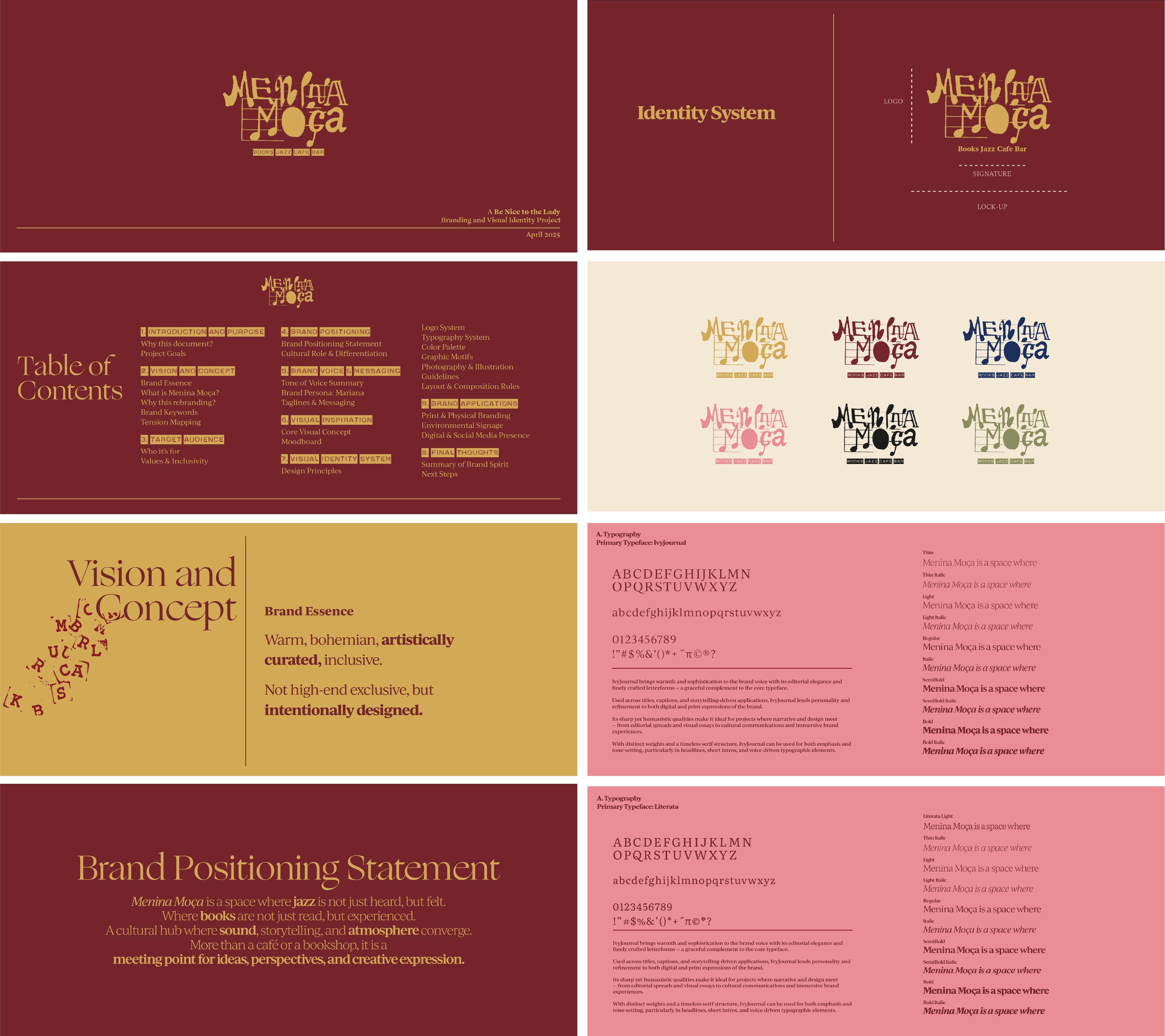
02 Branding &
Strategy
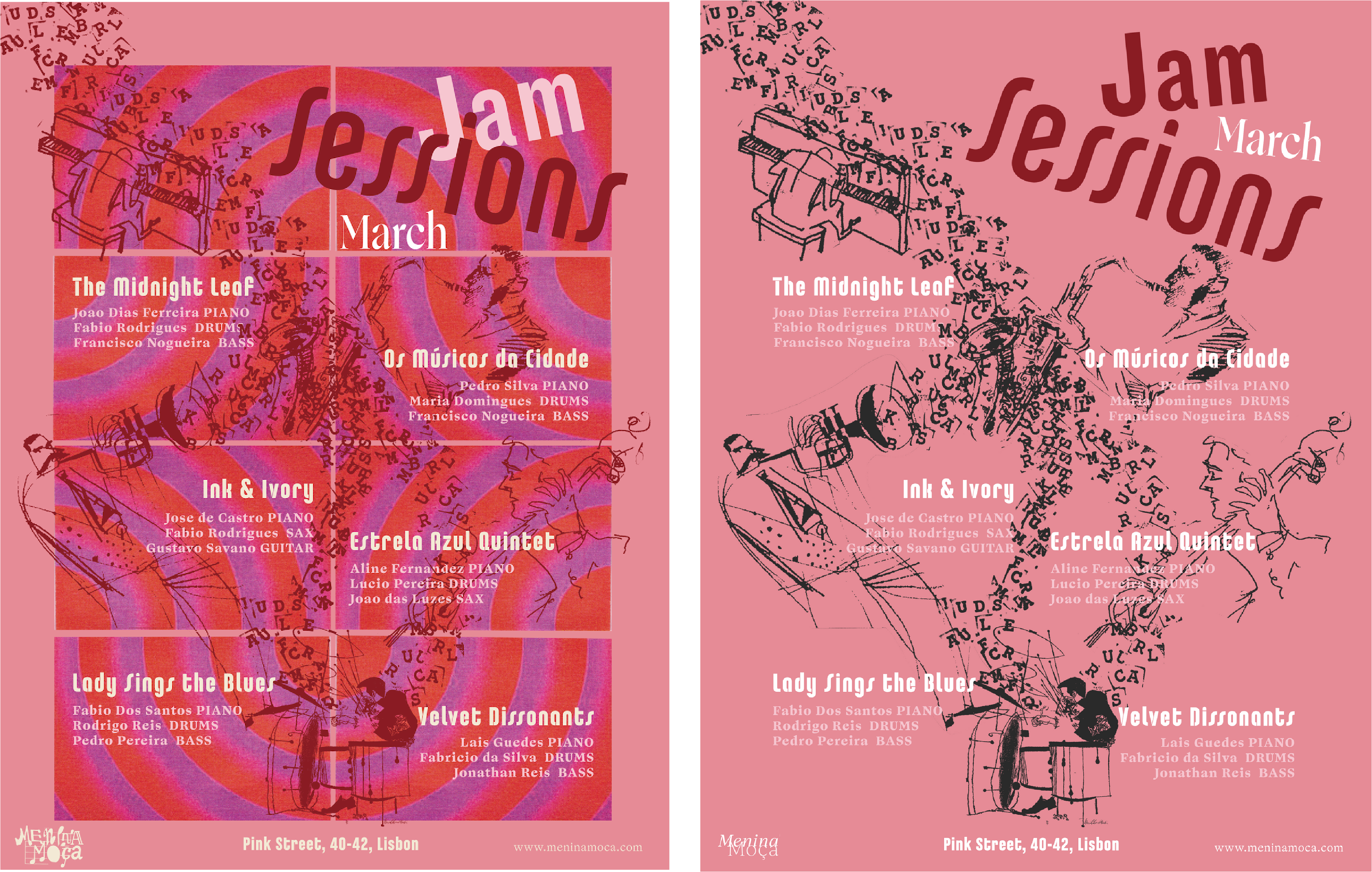
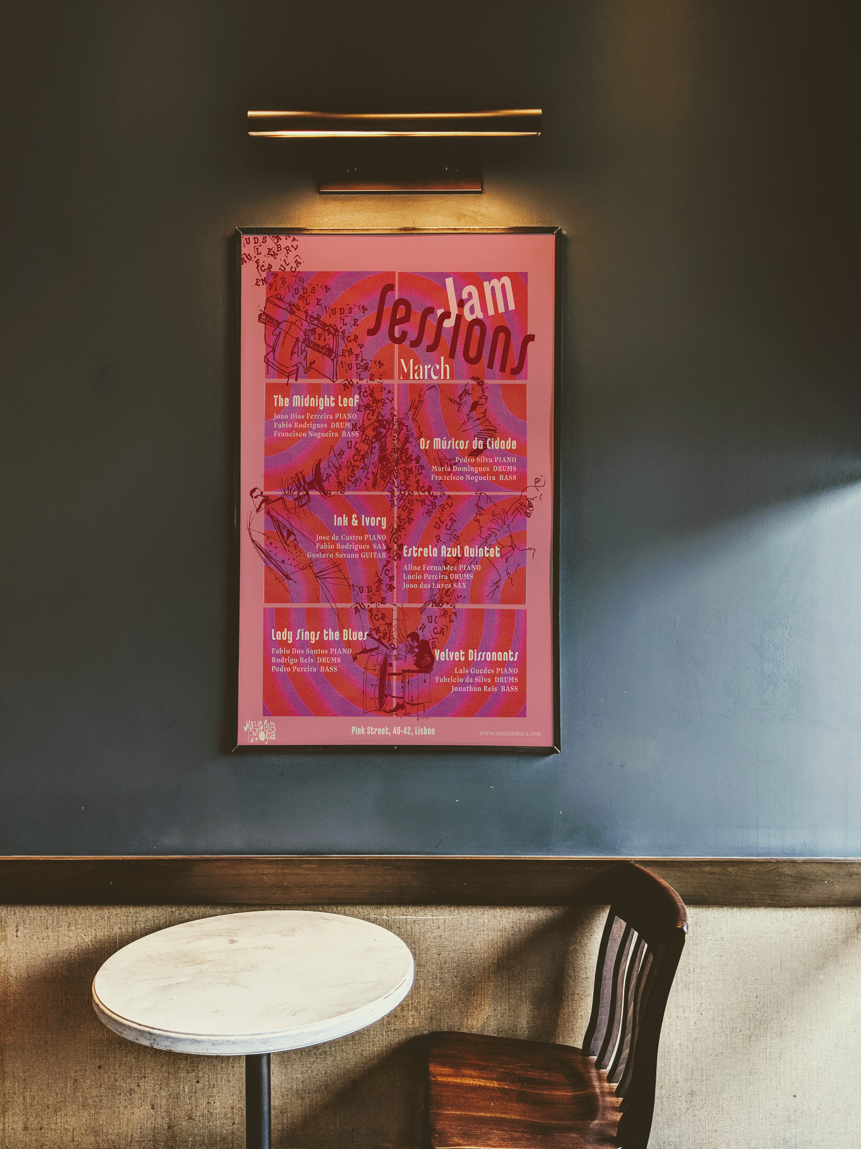
Ghost Treatments Rebranding
A reimagined identity for an advertising agency. The rebrand used a handcrafted approach to create a bold, distinctive presence for the brand.
Logo Creation
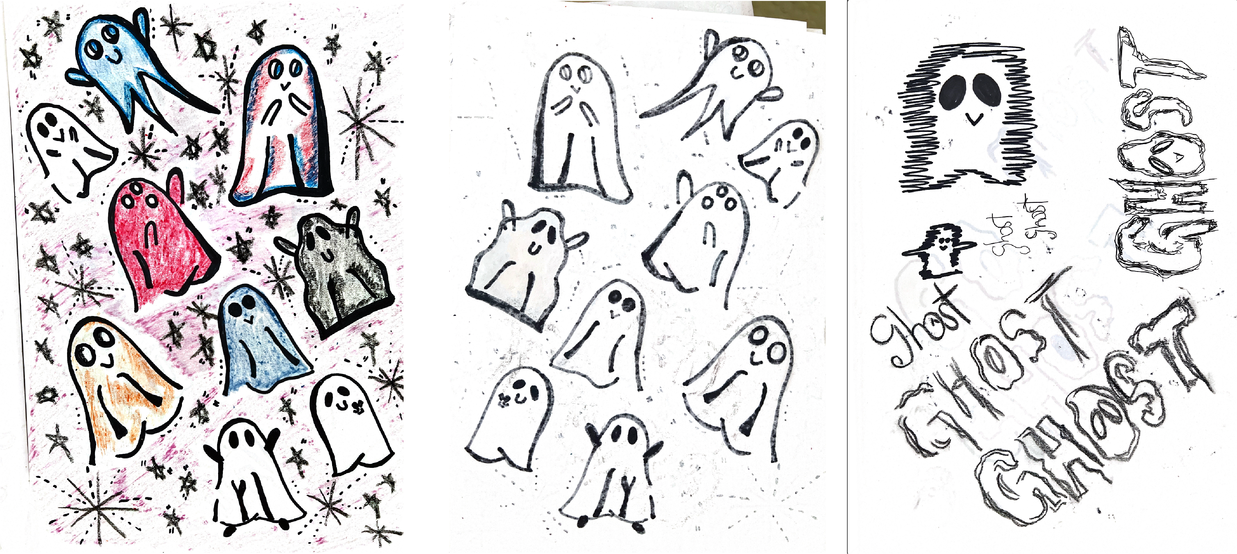
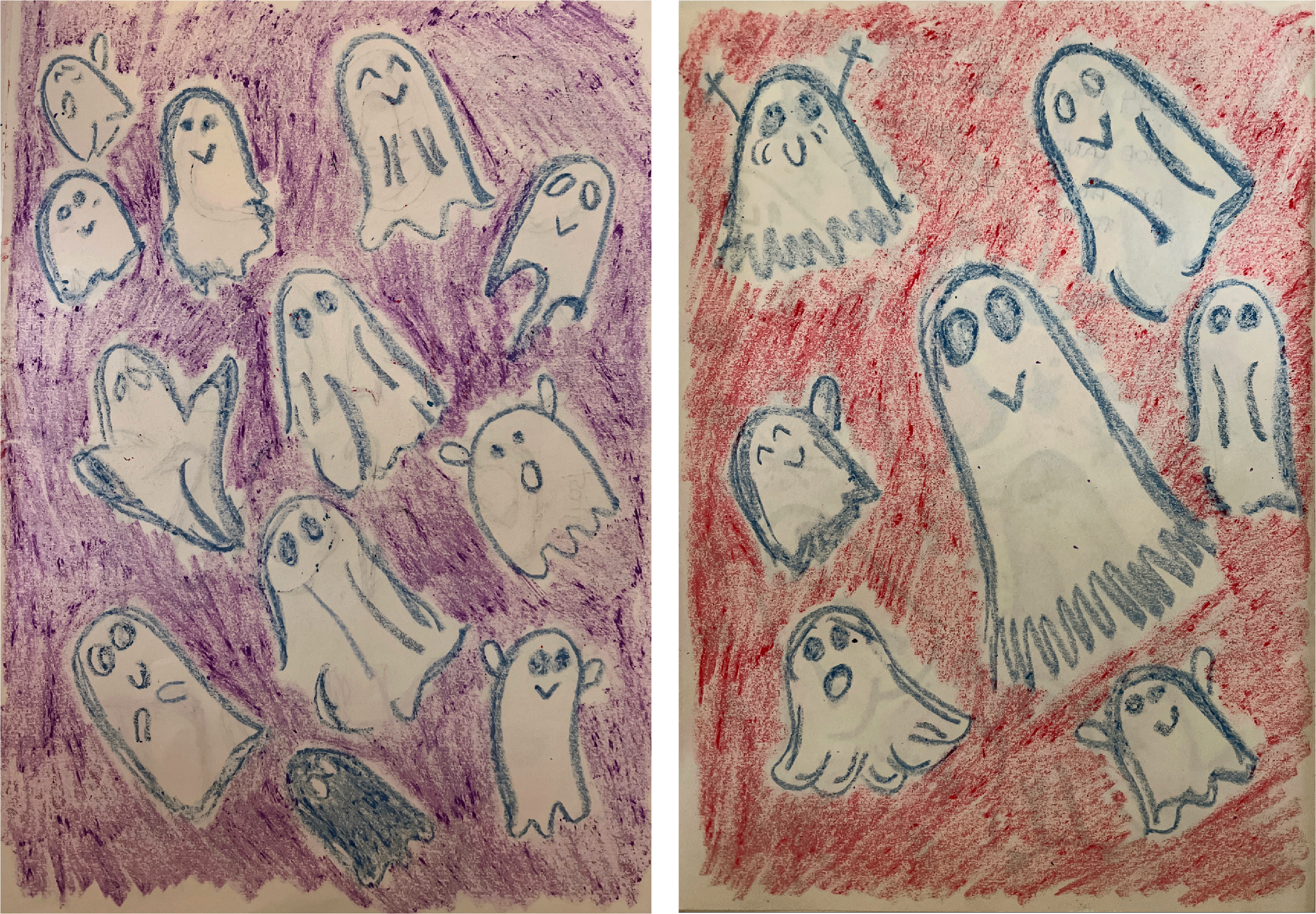
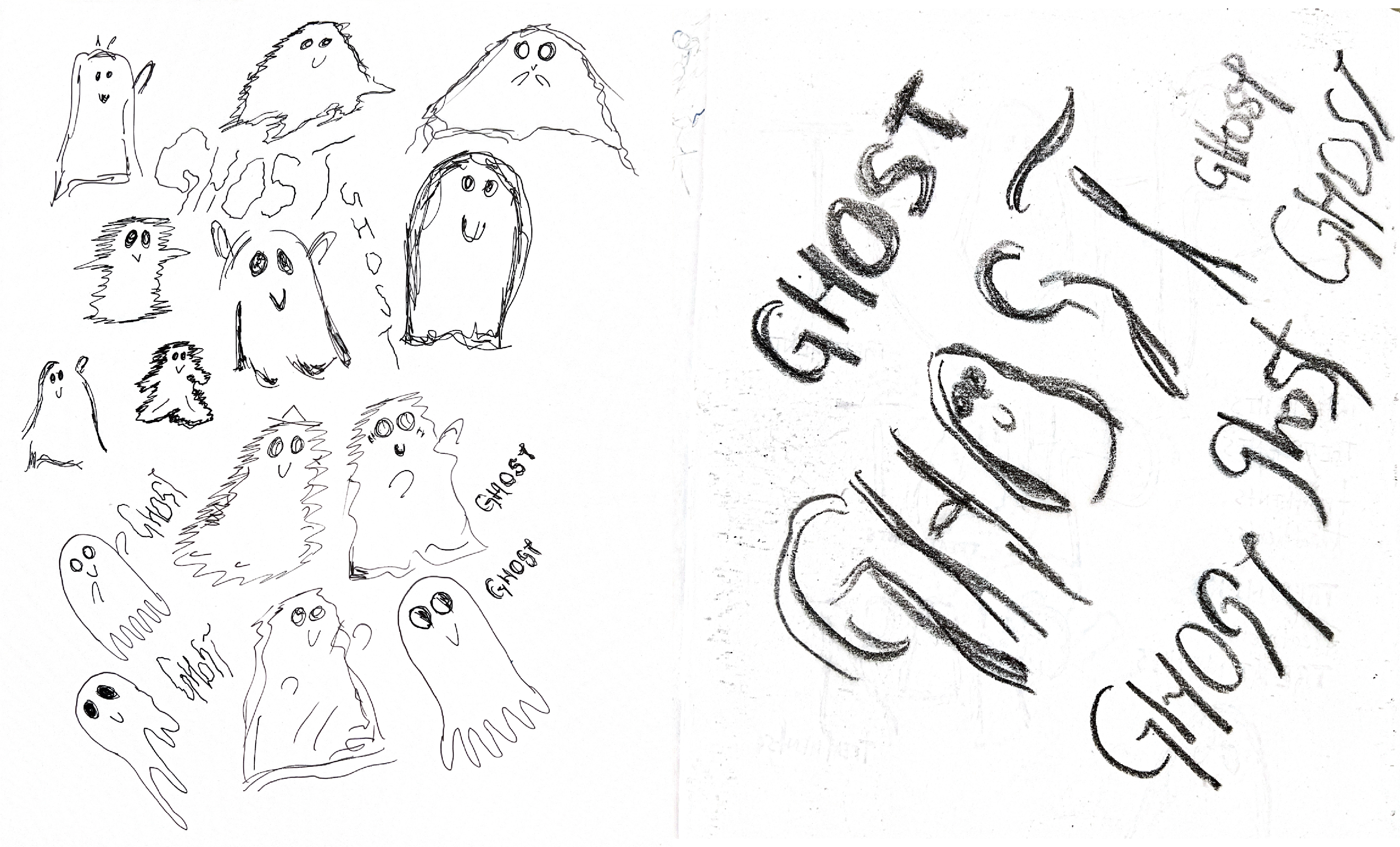
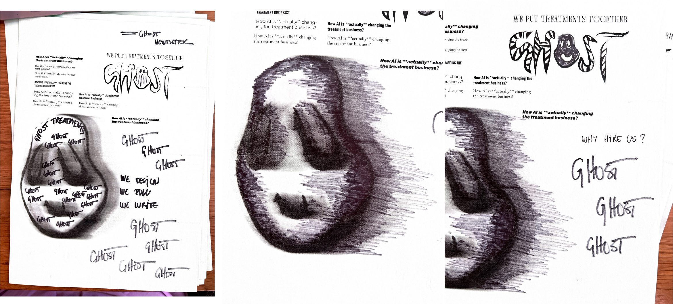
Sketching Ideas
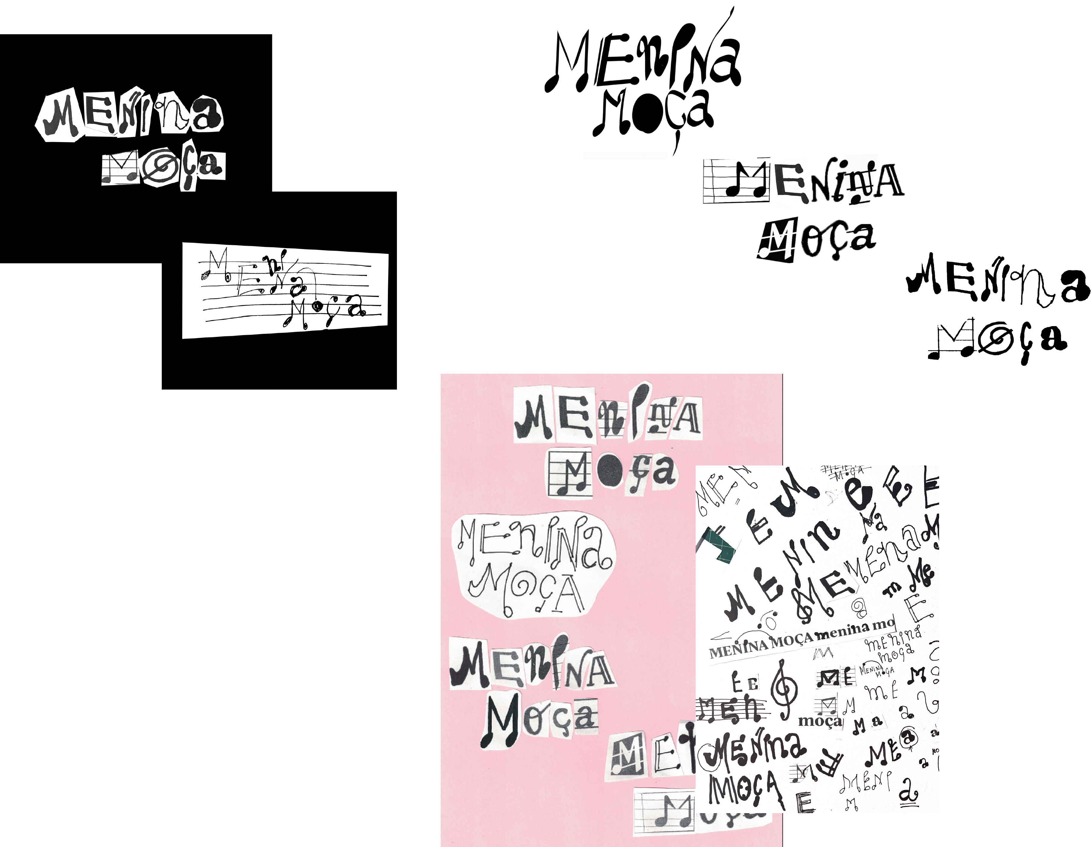
The Ghost identity began with hand-drawn sketches exploring different ghostly characters and type treatments. These early drawings capture the spirit of spontaneity and experimentation that defines the brand. By keeping the sketches raw and varied — from playful figures to darker, more abstract interpretations — we laid the foundation for a logo system that balances personality with adaptability.
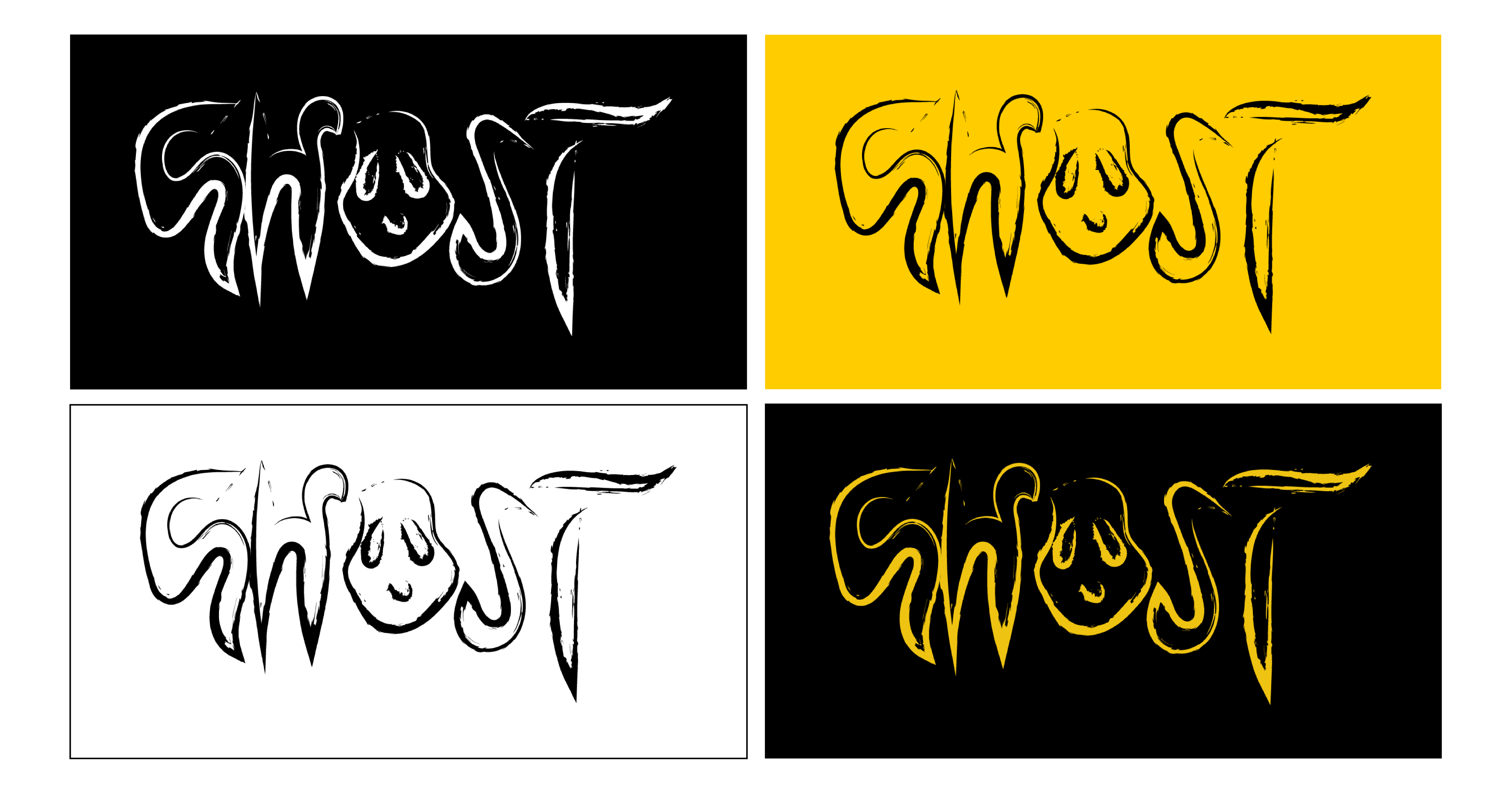
Defining Guidelines
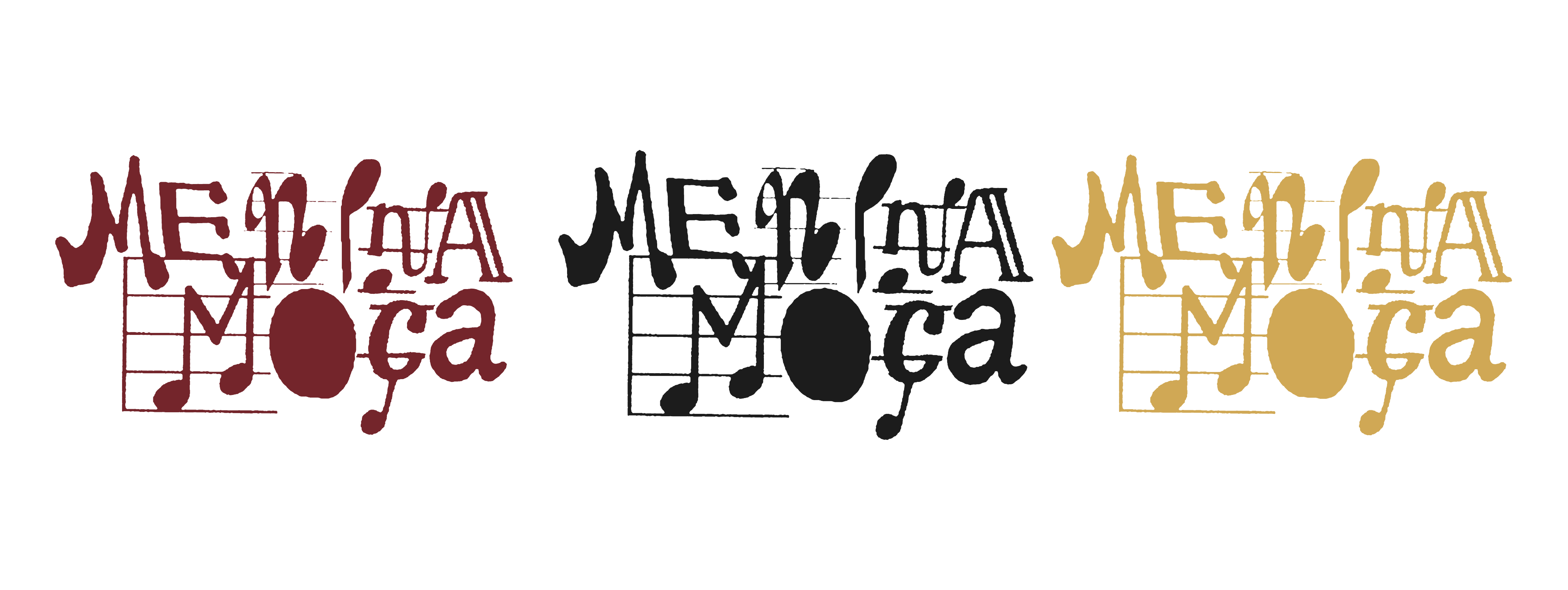
The finalized Ghost logo was distilled into a sharp yet organic wordmark. Its irregular lines suggest movement and imperfection, evoking the human hand behind the design. To ensure consistent use, the brand system includes primary and secondary logos, stacked and monogram versions, and clear spacing rules. Black, white, and yellow provide a flexible palette for different contexts while maintaining strong visual recognition. These guidelines anchor the brand in clarity without erasing its raw energy.
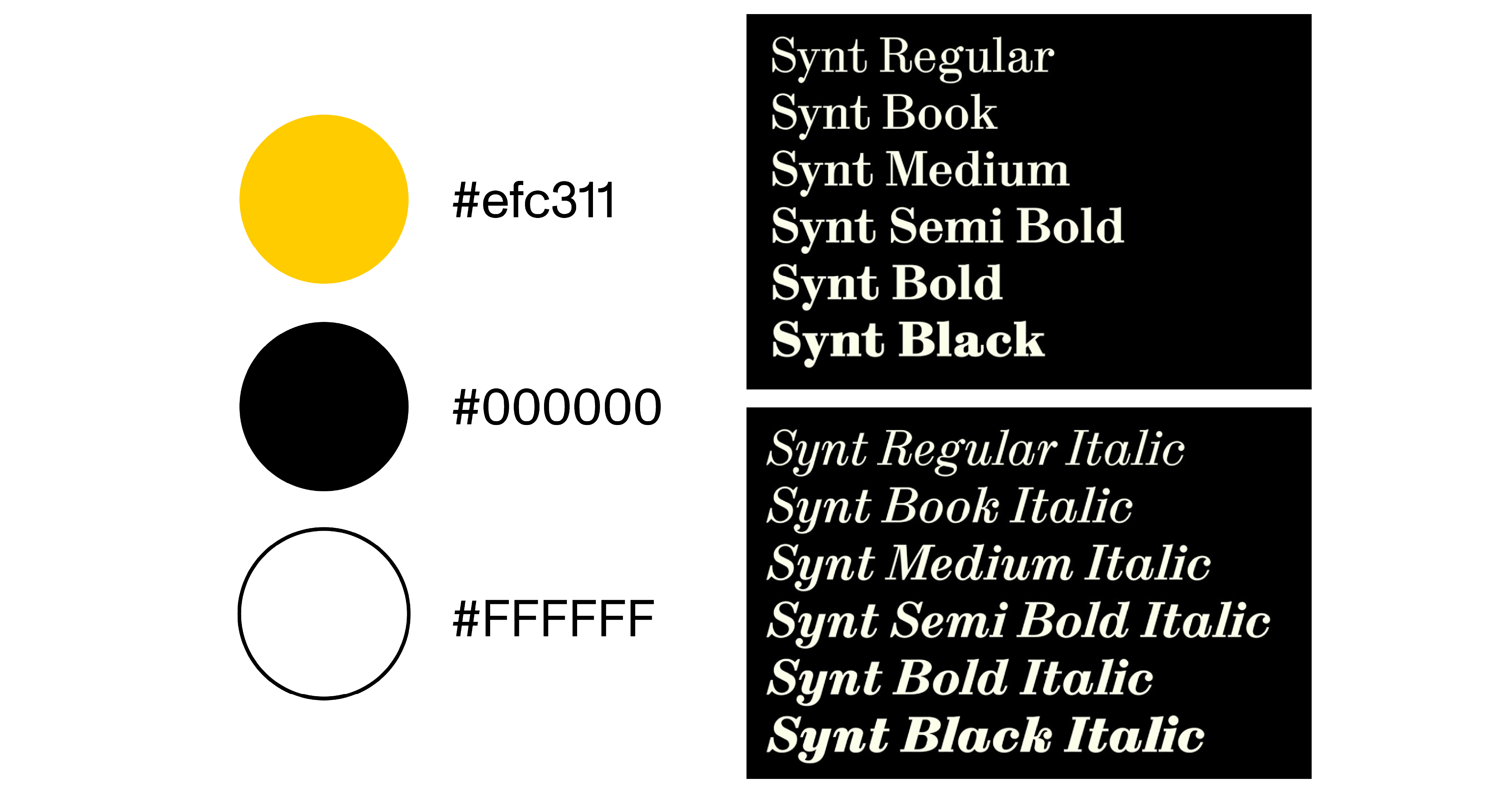
Typography
Character & Adaptability
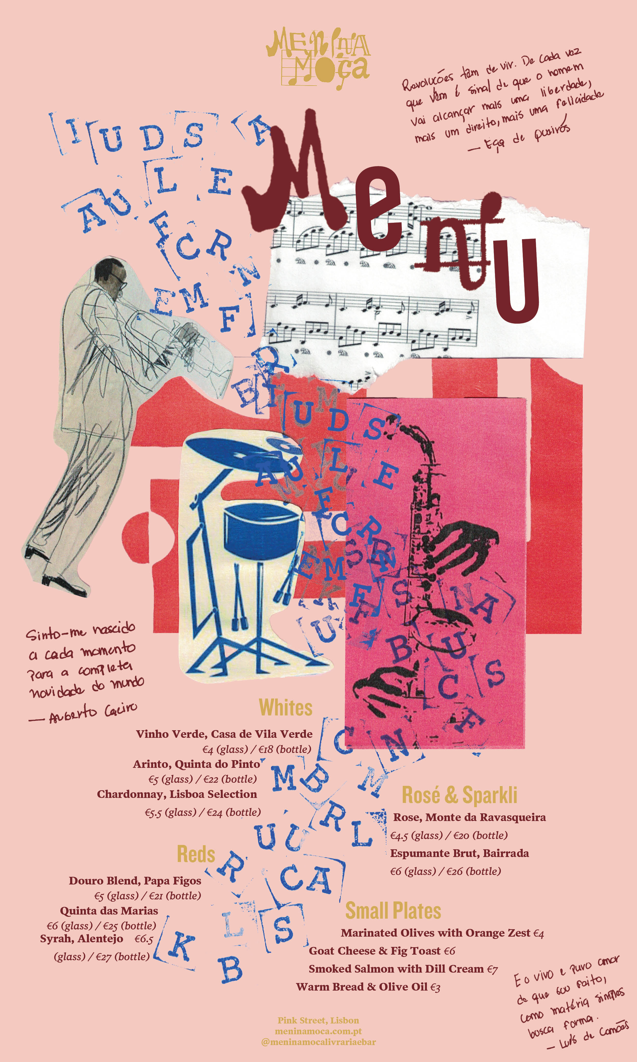
The brand book codifies Ghost's visual identity into a practical toolkit. Typography centers on Synt, a serif with character and adaptability, spanning multiple weights and italics to support everything from bold headlines to nuanced editorial applications. The color palette — black for sophistication, white for clarity, and yellow for impact — grounds the brand in both authority and playfulness. Together, these choices create a system that is rigorous yet expressive, reflecting Ghost's dual nature as a strategic partner and a creative disruptor.
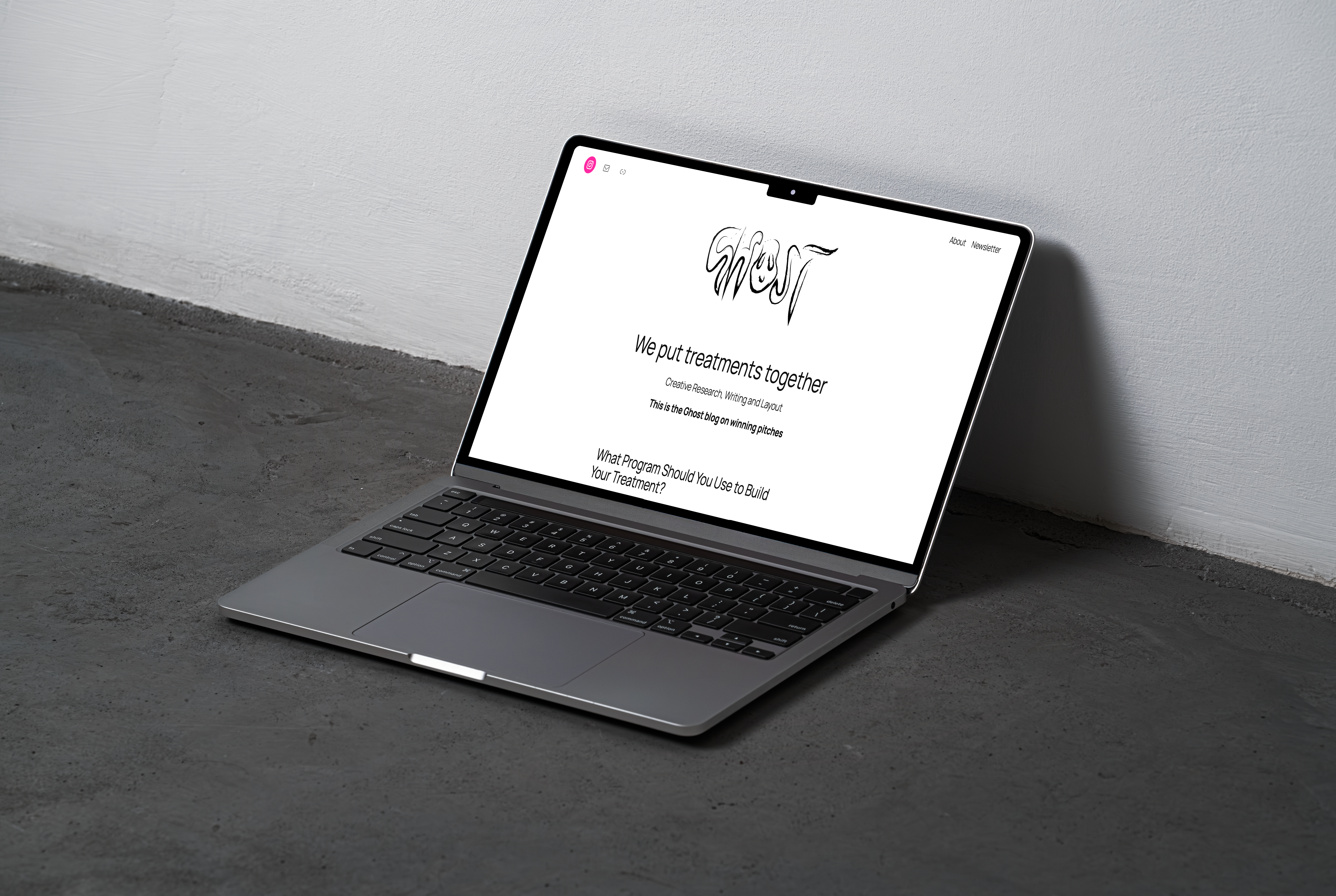
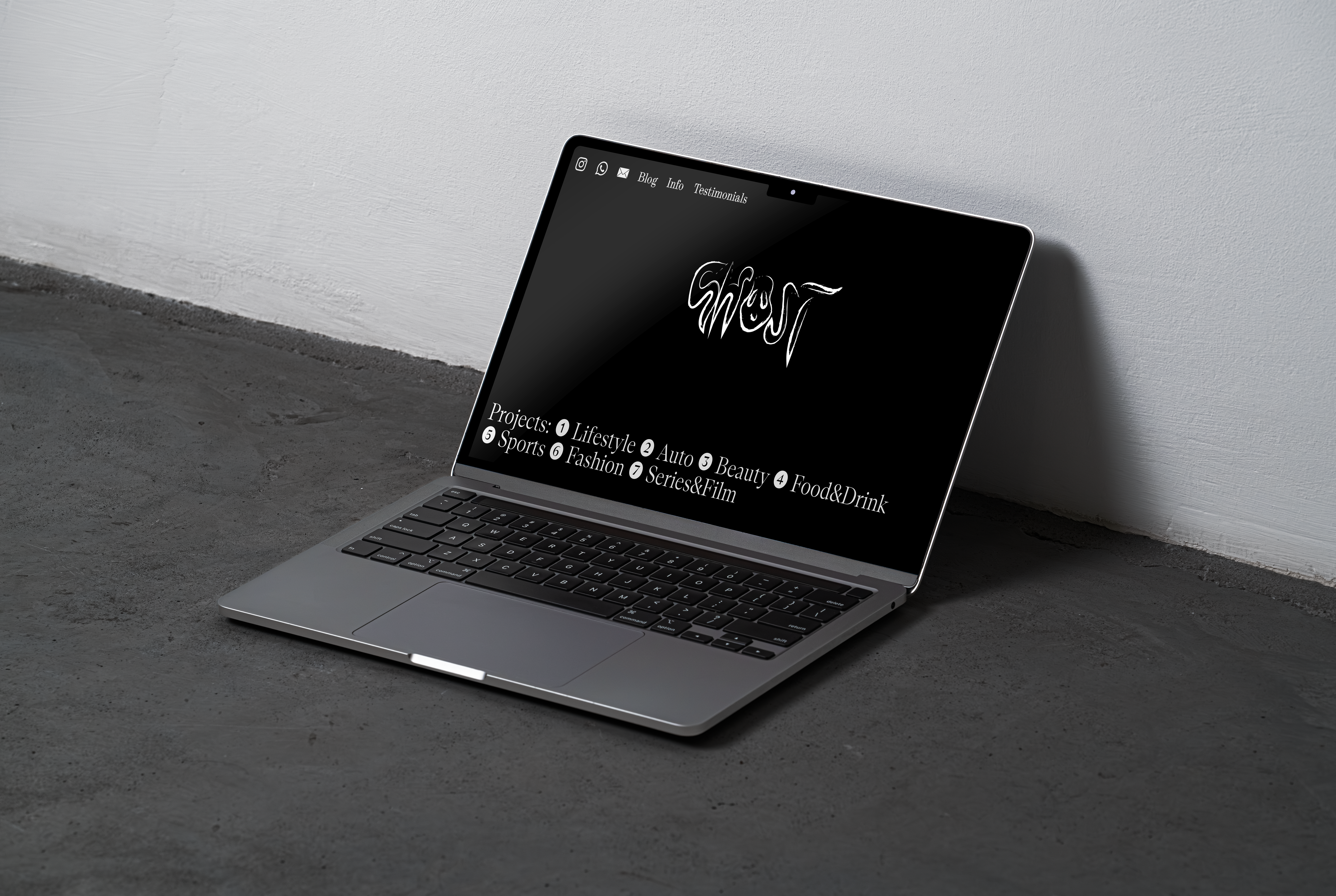
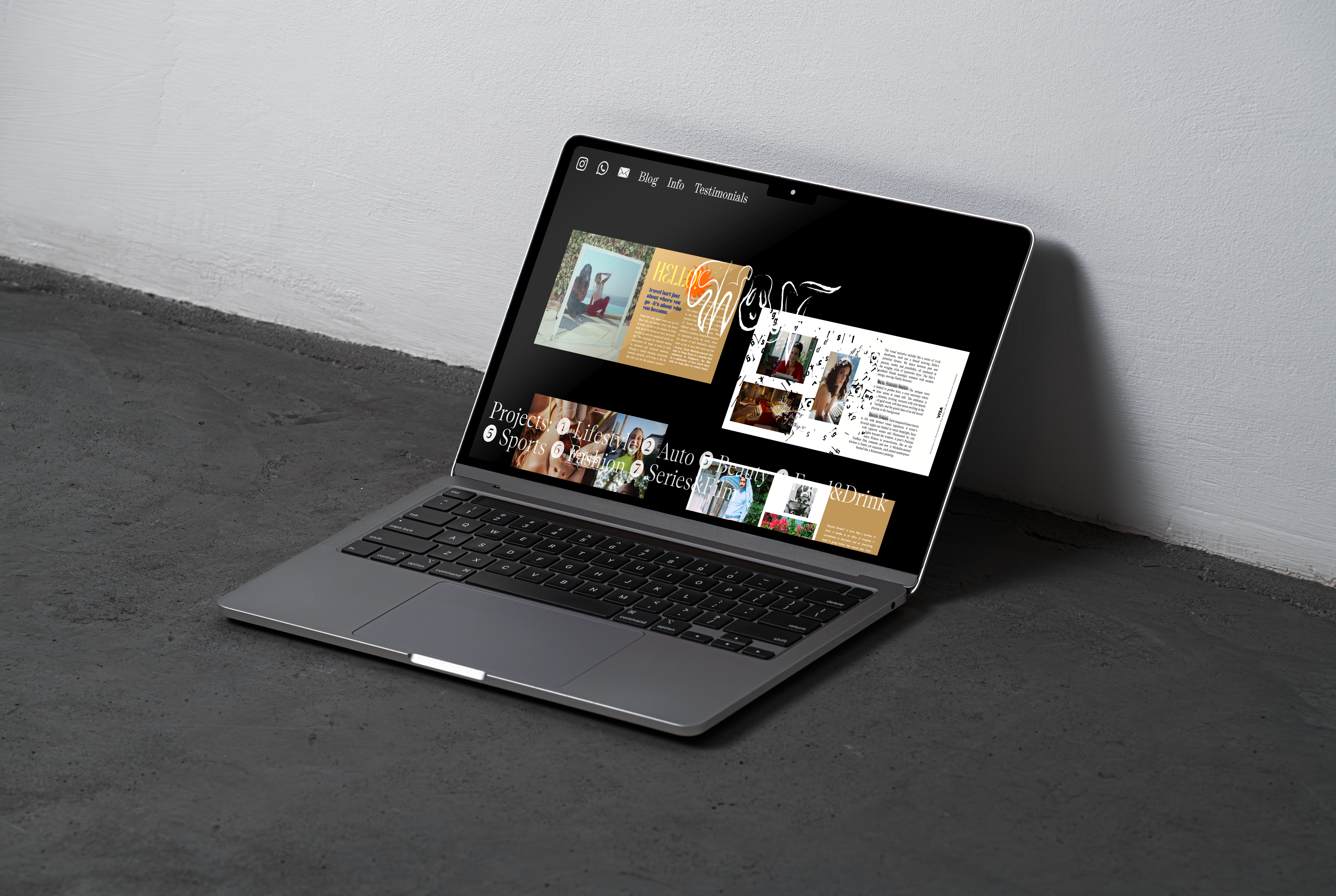
Website Design
Aesthetic & Logo Application
The website applies the Ghost identity in a clean, cinematic framework. The dark background acts as a stage, letting the logo and project imagery command attention. Typography and layout follow the brand book, ensuring cohesion between digital presence and printed collateral. The site demonstrates how Ghost adapts to different client industries — lifestyle, auto, beauty, food & drink, sports, fashion, and film — while always keeping a consistent tone of voice and aesthetic.
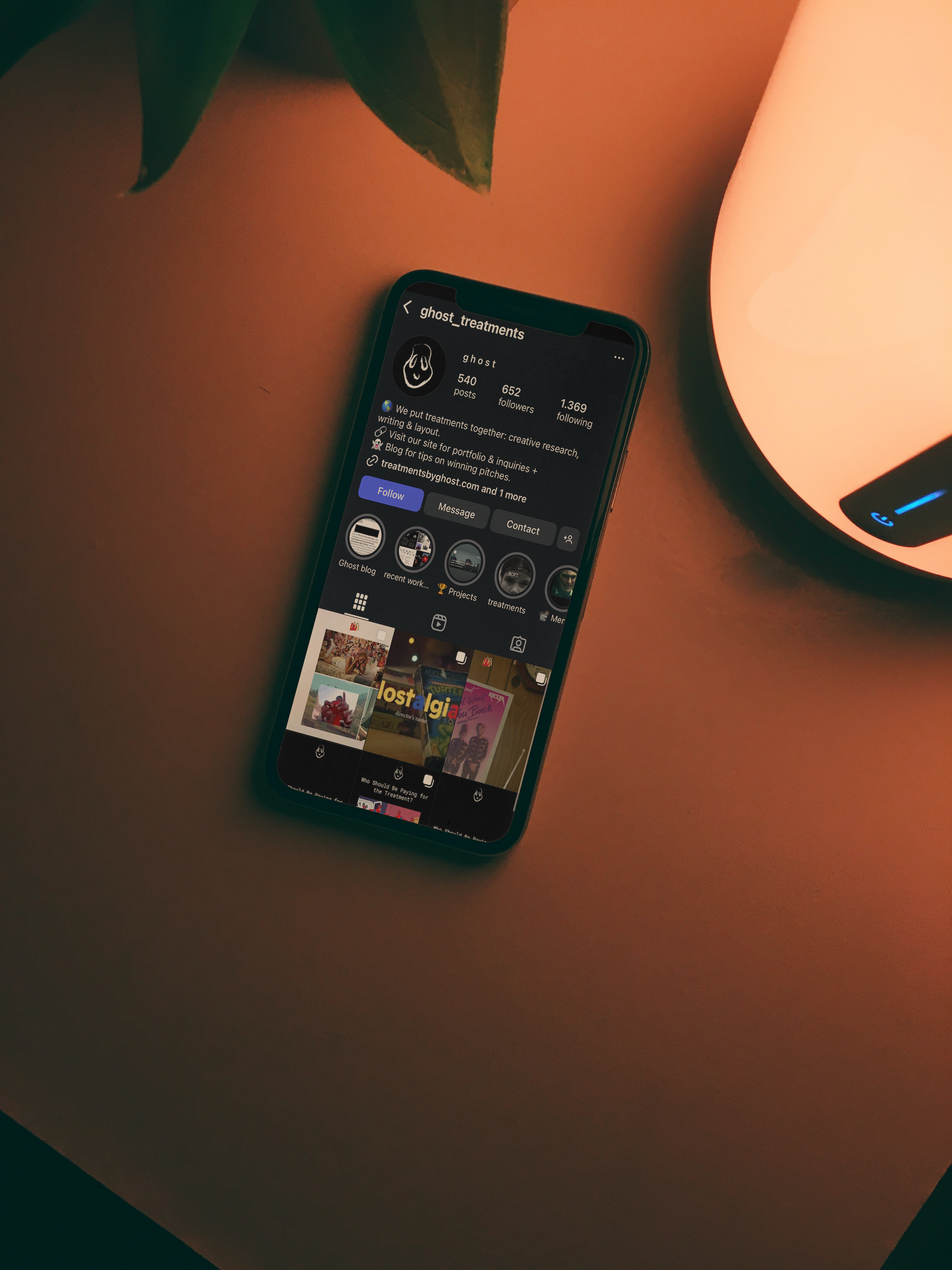
Social Media
Ghost's social media avatar is represented by the hand-drawn logo featuring the friendly face of a ghost. This ensures brand cohesiveness across platforms, keeping the brand instantly recognisable.
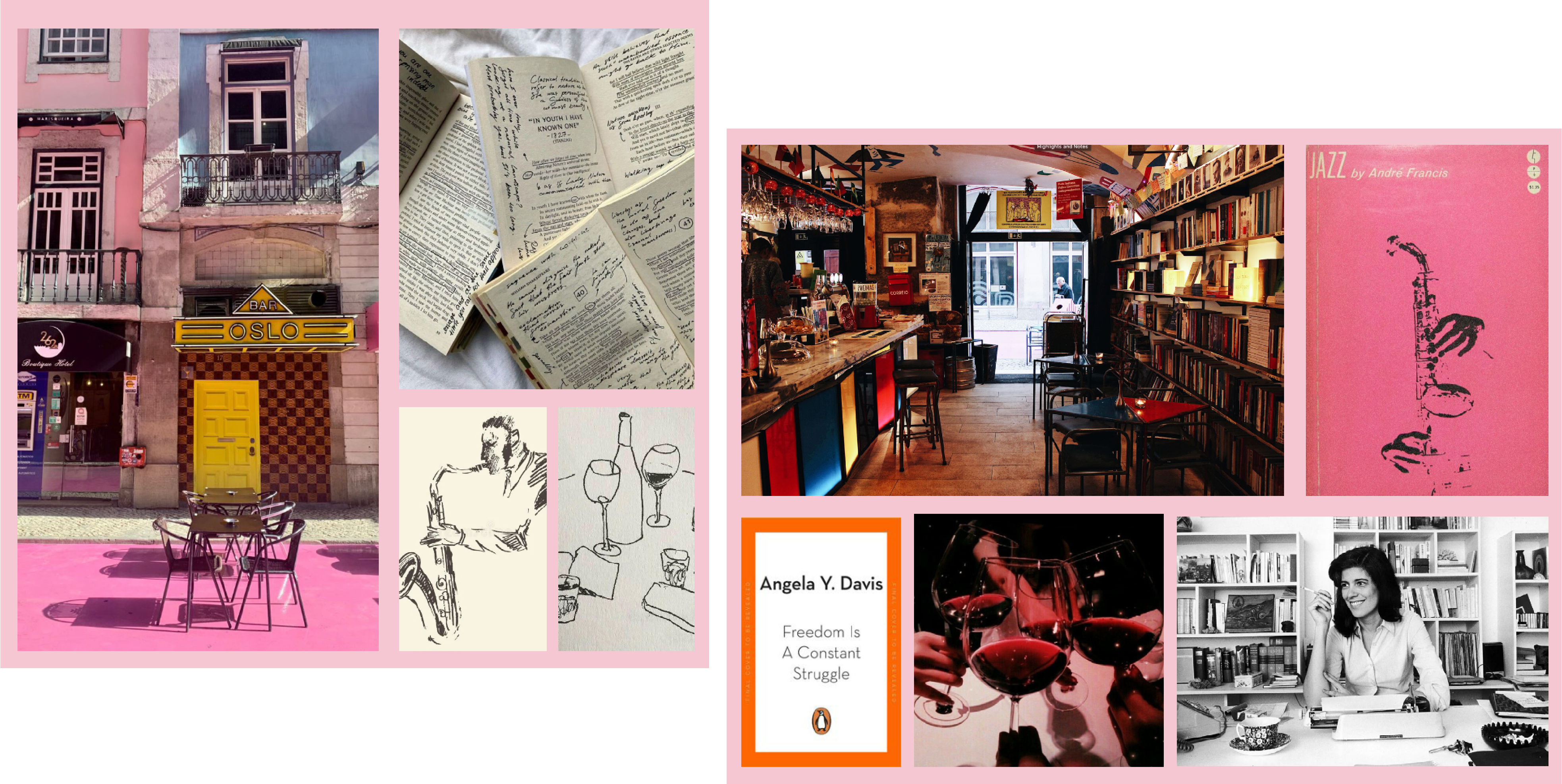
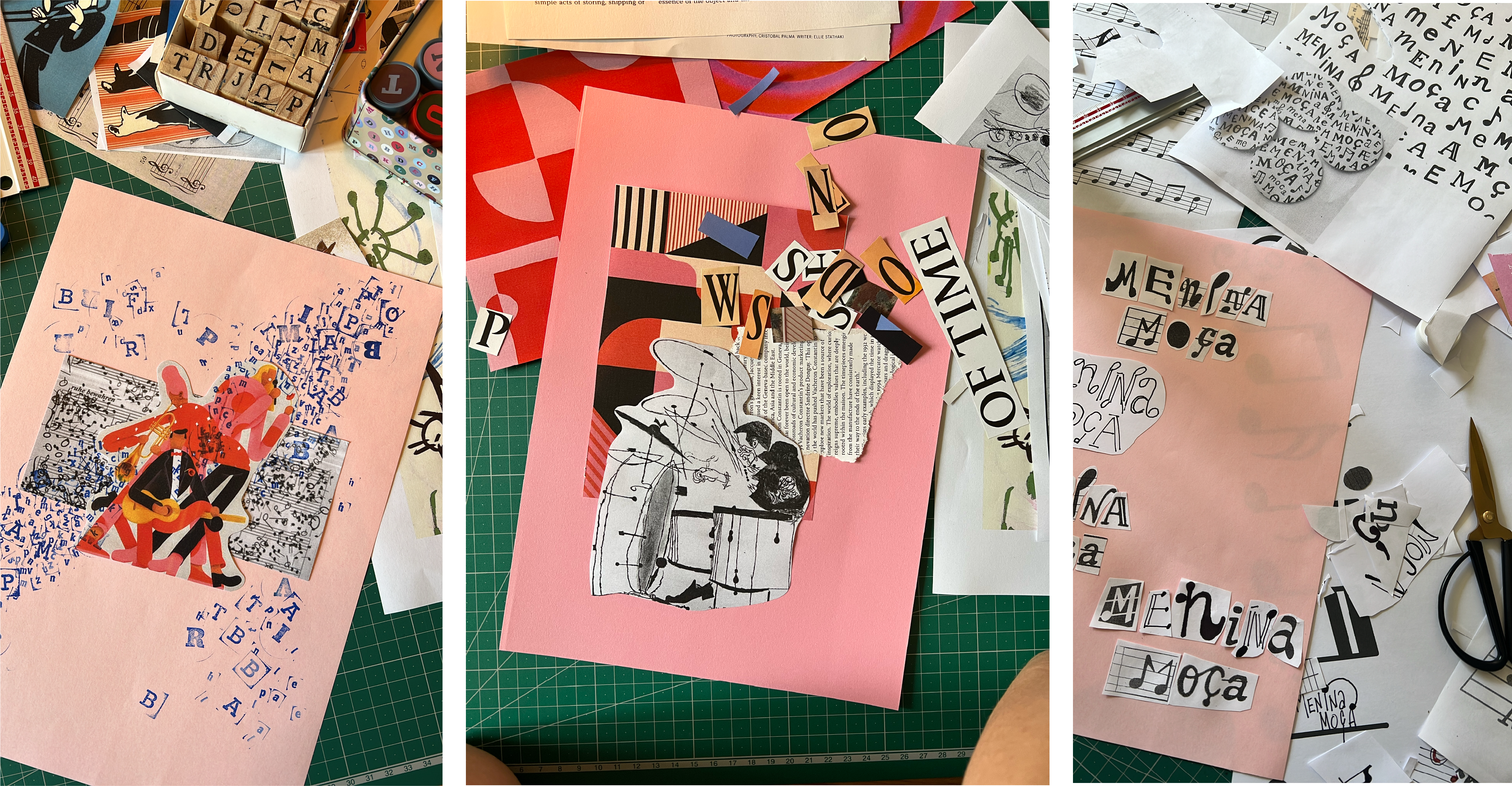
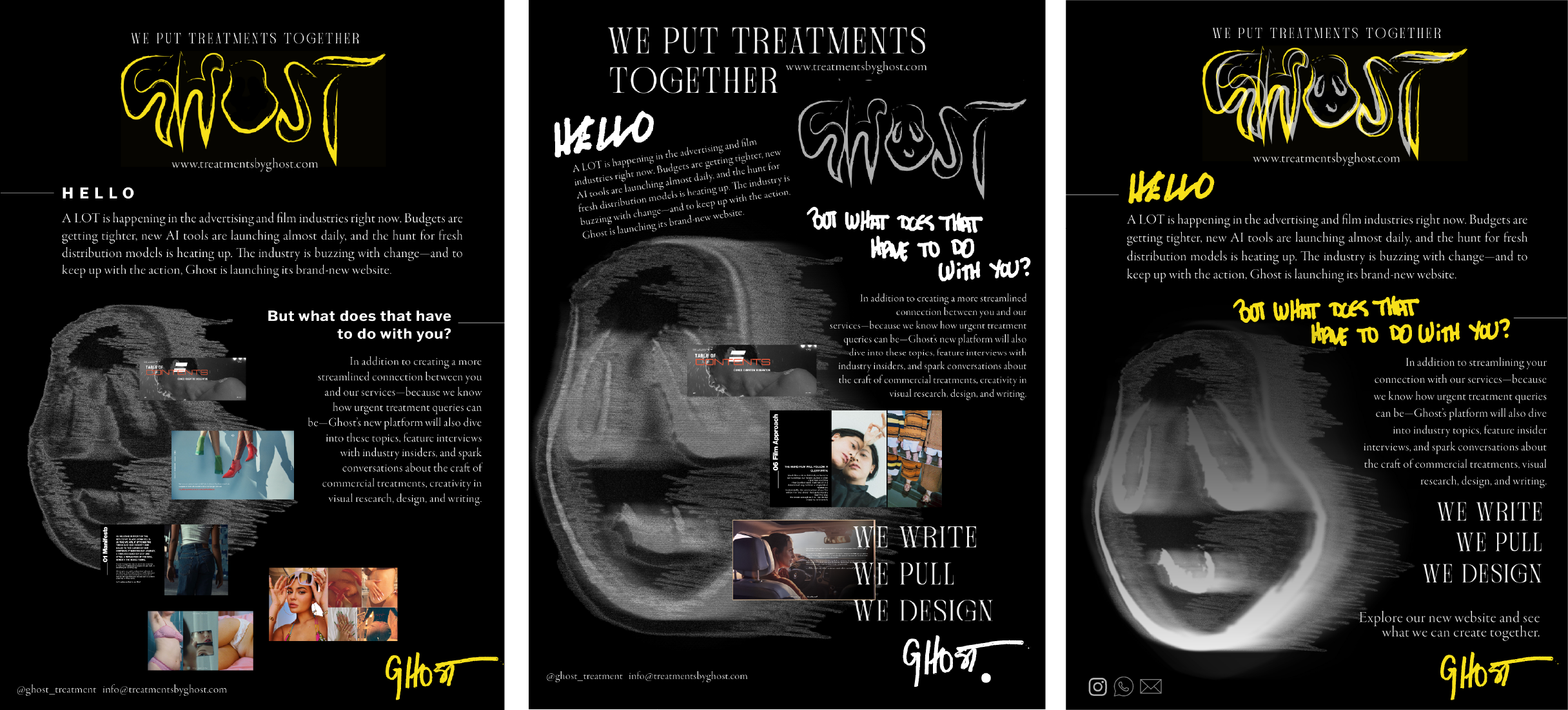
Newsletter
Strategy & Storytelling
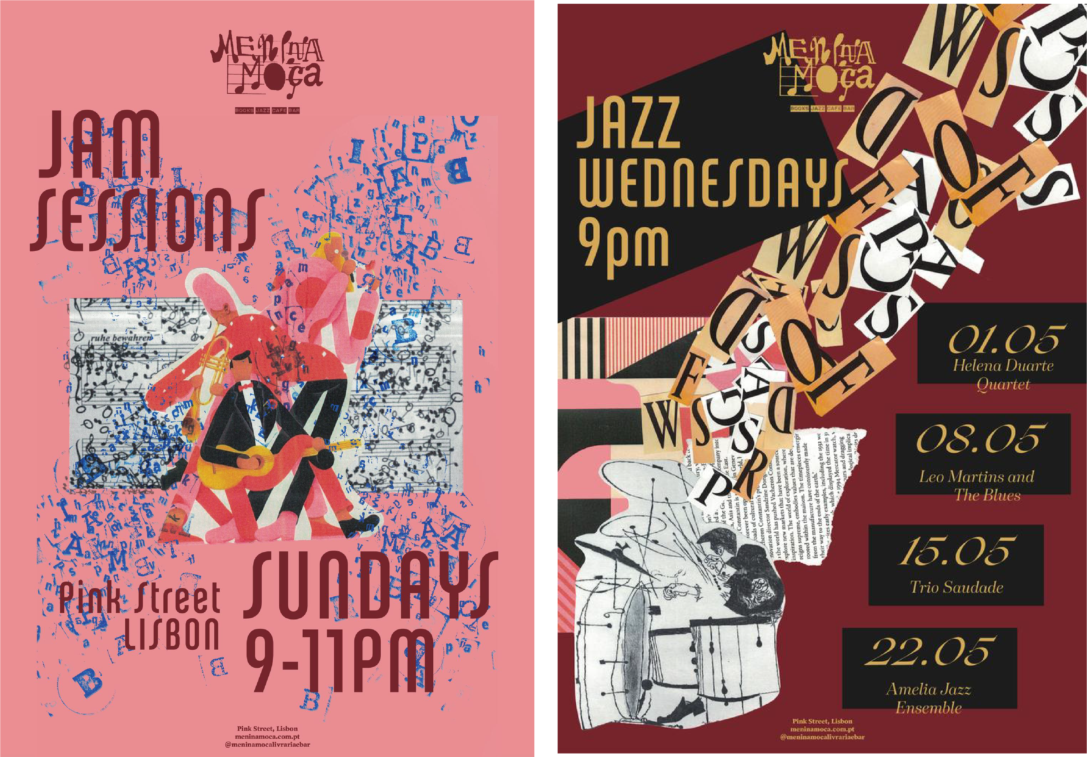
The newsletter translates Ghost's identity into direct communication with clients and collaborators. Its design emphasizes bold imagery, handwritten accents, and a layered collage aesthetic — echoing Ghost's hands-on approach. Each edition highlights not only new projects but also reflections on industry shifts, blending strategy and storytelling. The newsletter is both a marketing tool and a creative artifact, reinforcing Ghost's identity as a brand that values depth over decoration.
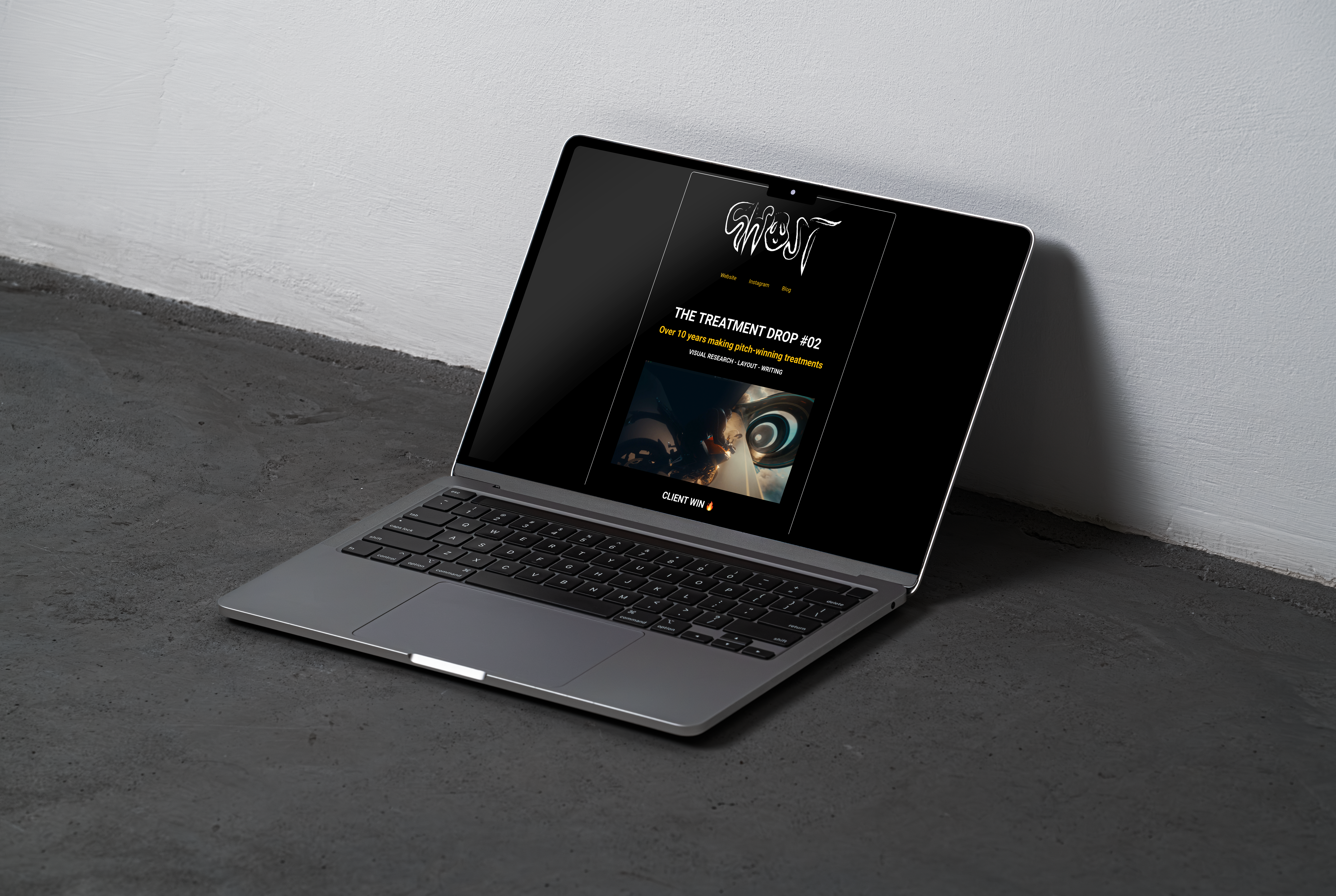
The Ghost Blog
Clean & Bold
The blog extends Ghost's editorial voice, documenting insights into the world of treatments and beyond. Clean layouts and bold type treatments frame in-depth writing that explores process, industry trends, and creative philosophy.