03 Design
as Activism

A Nation in Pieces: Recovering Fractured Narratives

An analogue-to-digital collage project using urban space as a stage for confronting social and economic instability.
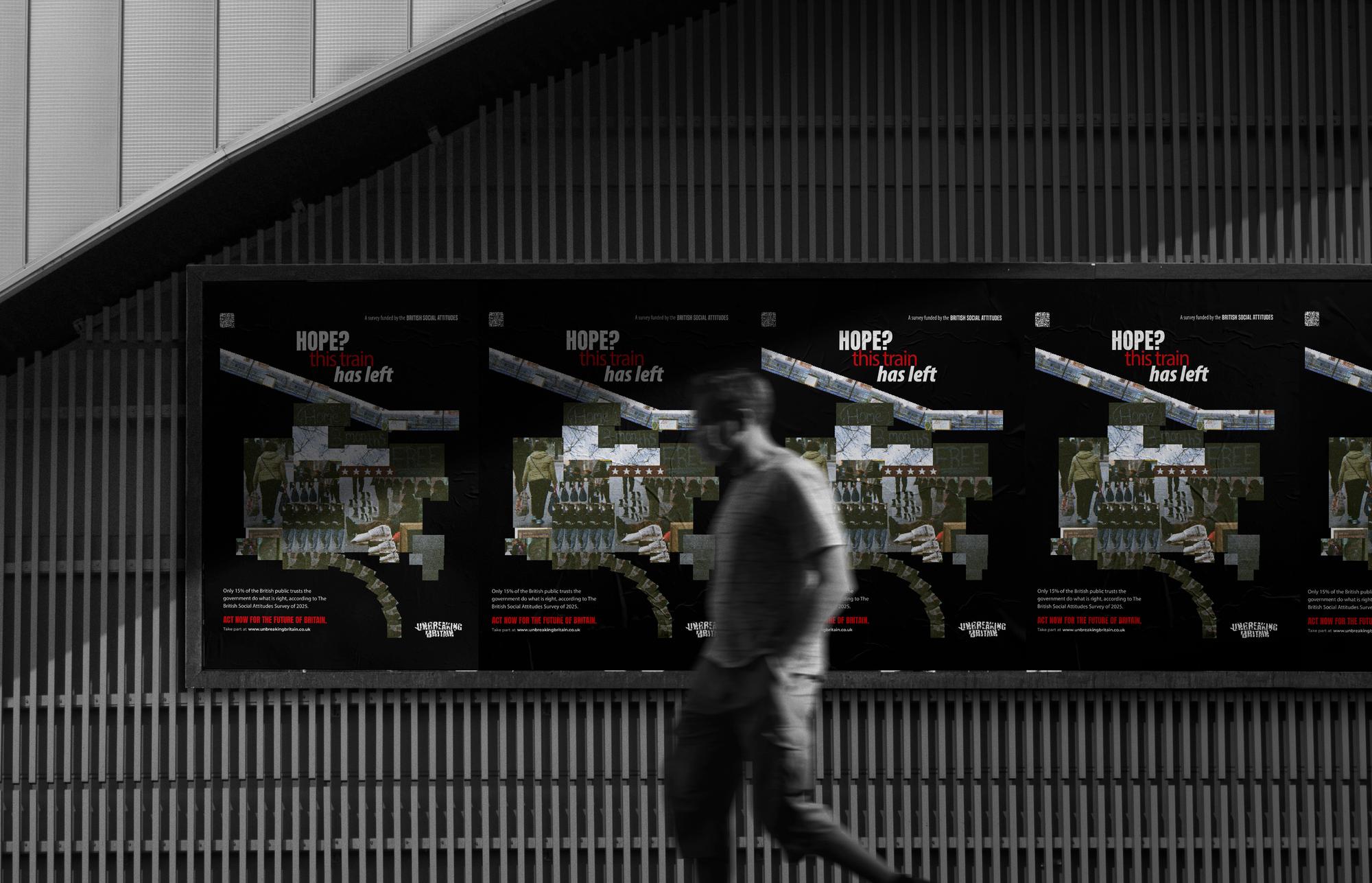
A Nation in Pieces poster

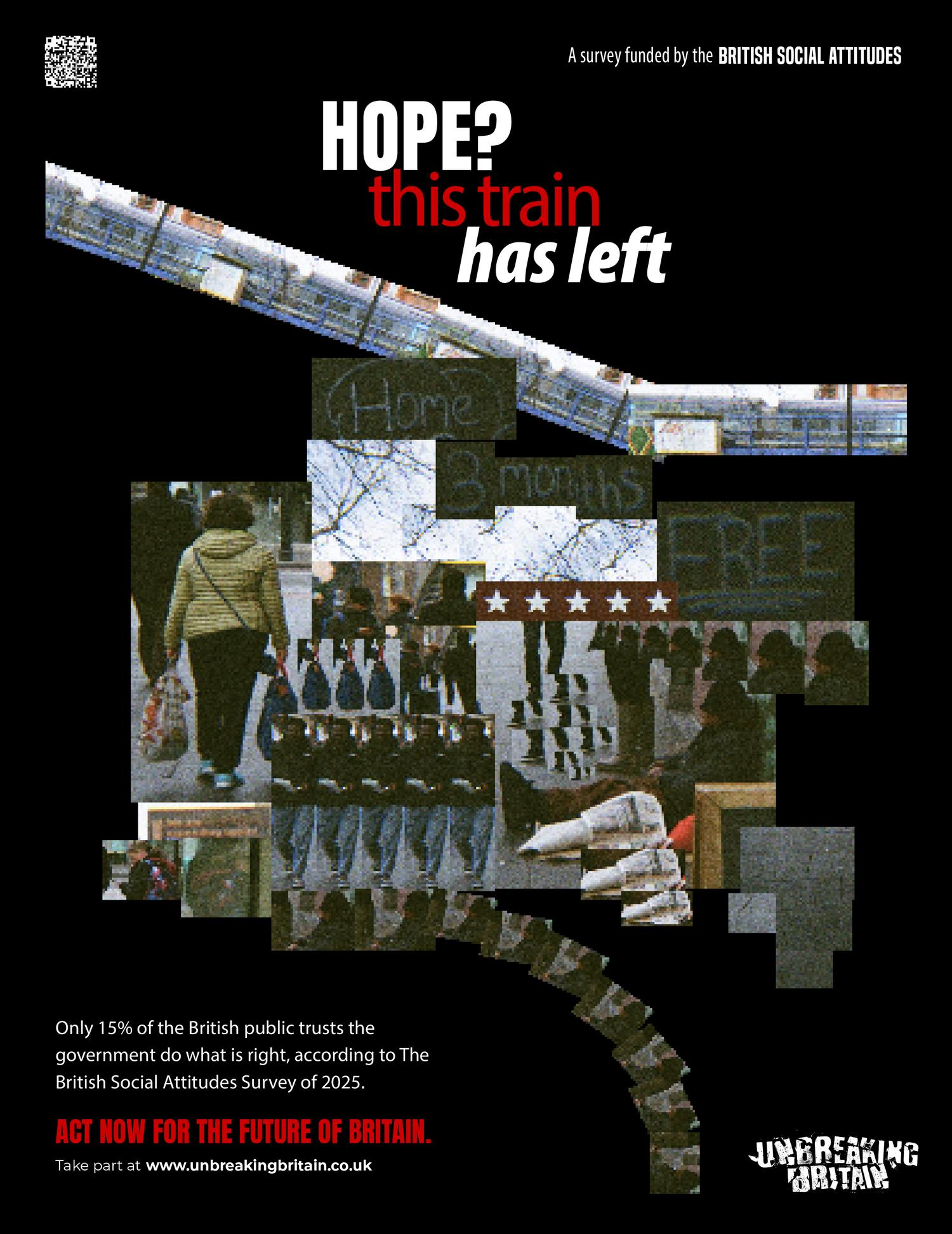
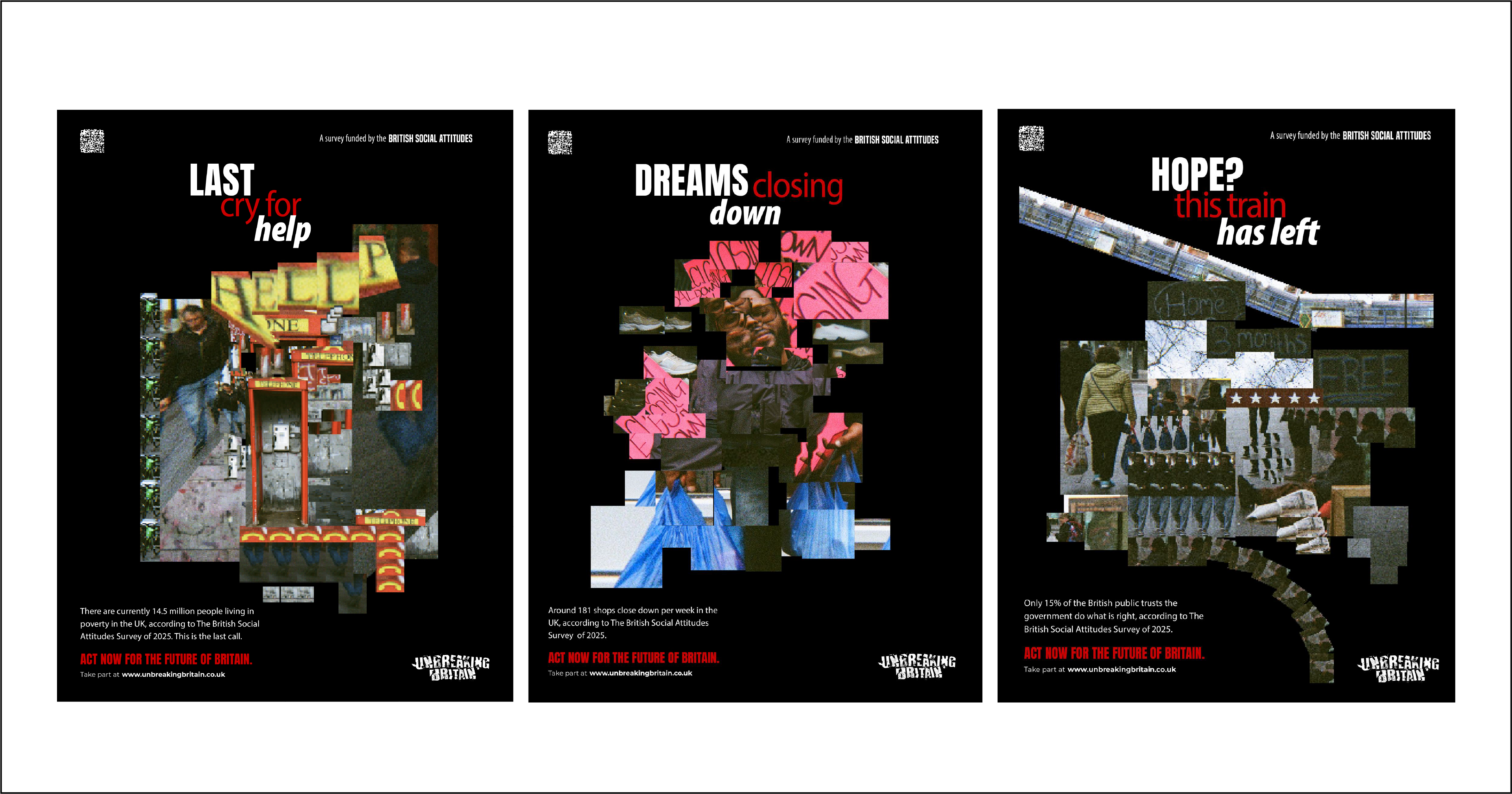
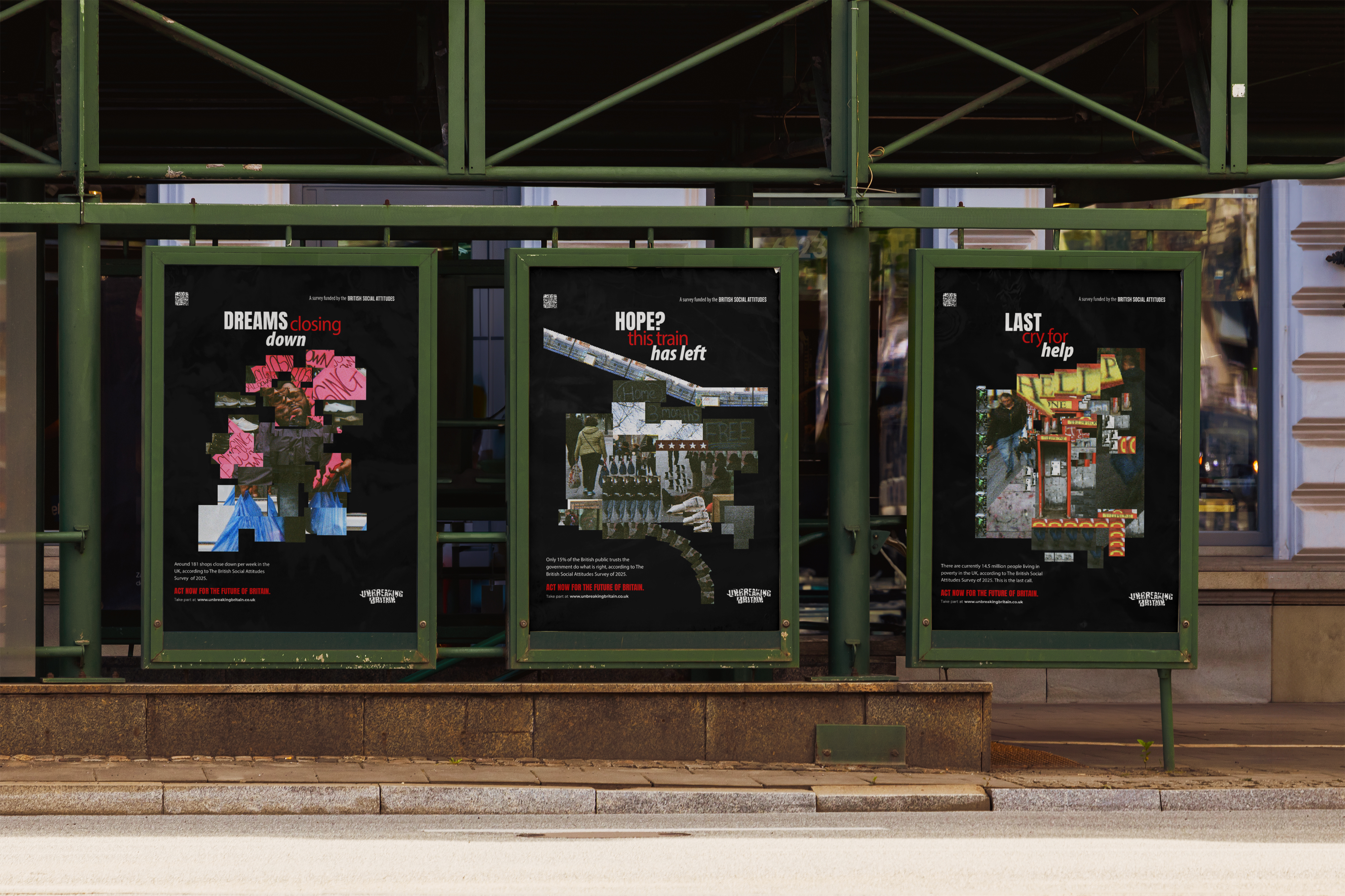
This series of three bus shelter posters mirrors the fractured state of British society. It draws on the bold, community-driven social messaging of South London's streets and on David Hockney's photographic experiments with perspective.
A Nation in Pieces overview

Concept

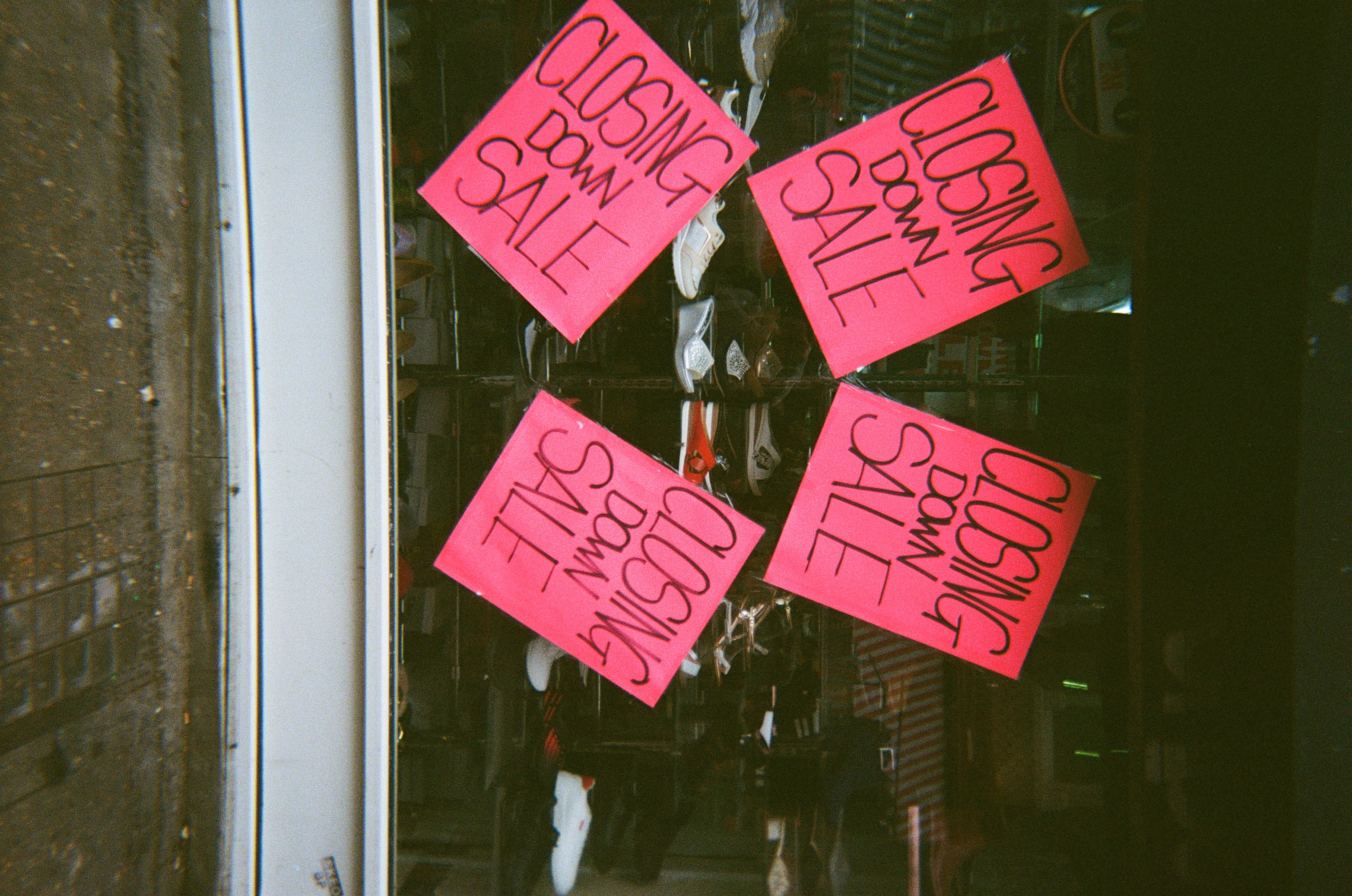
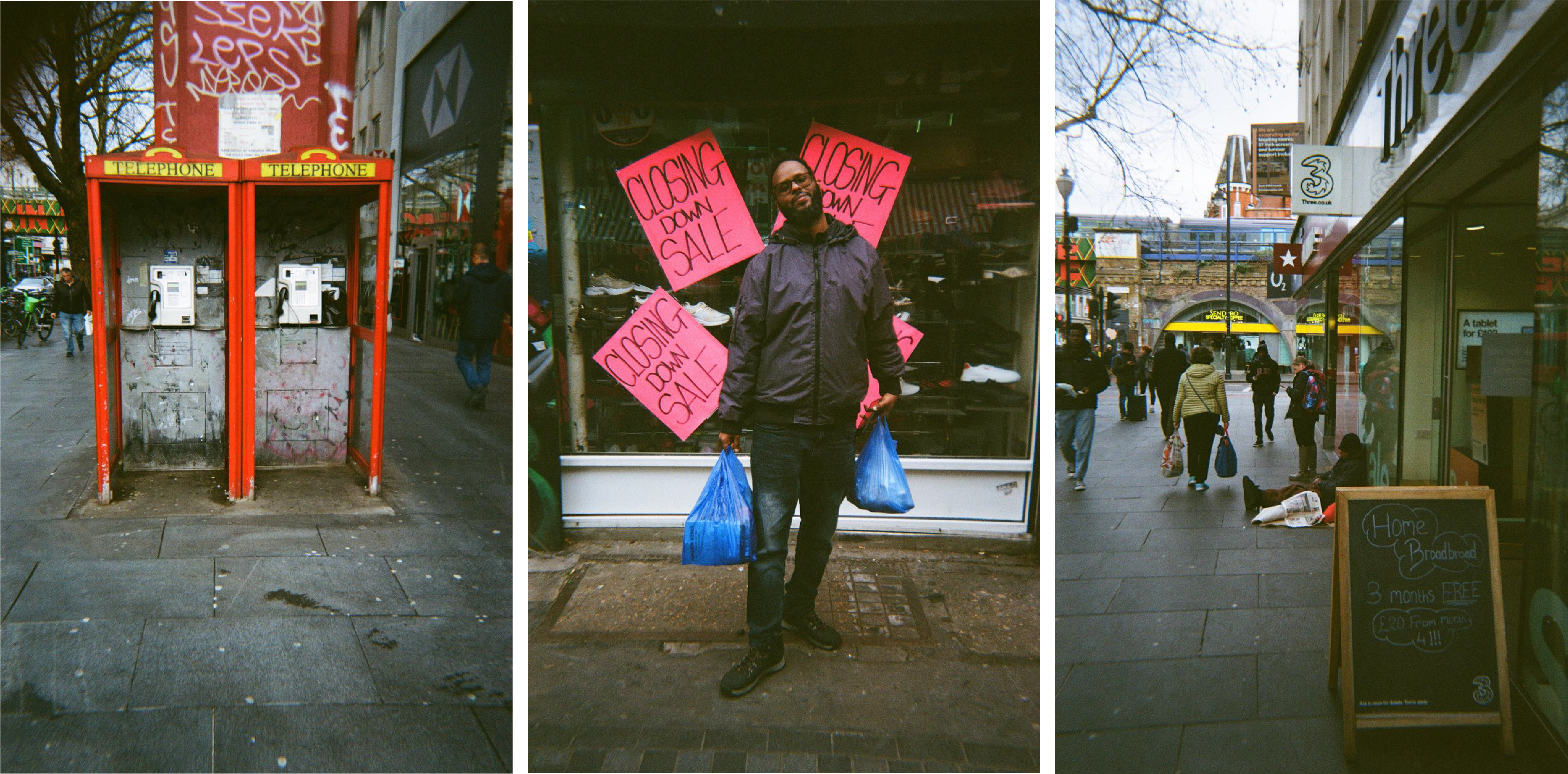
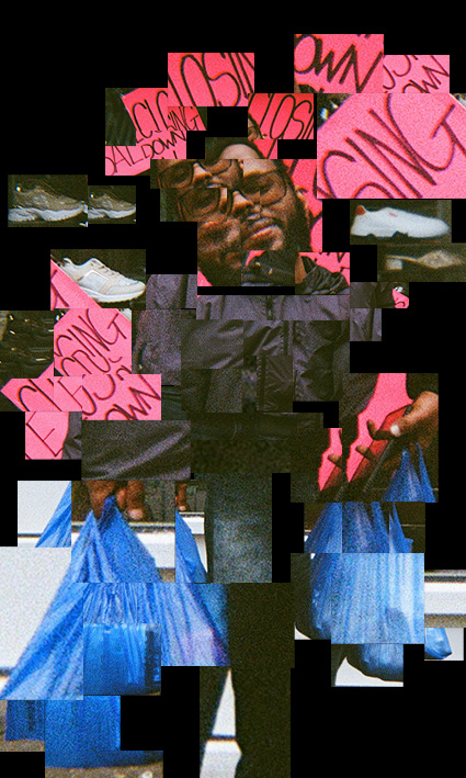
The posters were developed from original photography shot on a disposable point-and-shoot camera. The camera was chosen for its grainy, unfiltered look; the rawness and imperfection of analogue film come through on their own.

The photographs were taken in Brixton, one of South London's most economically disadvantaged areas, where the cost of living crisis is written on the streets. The collages were then assembled digitally to evoke fragmentation, a society coming apart.
Photography documentation
Scale testing

The Posters

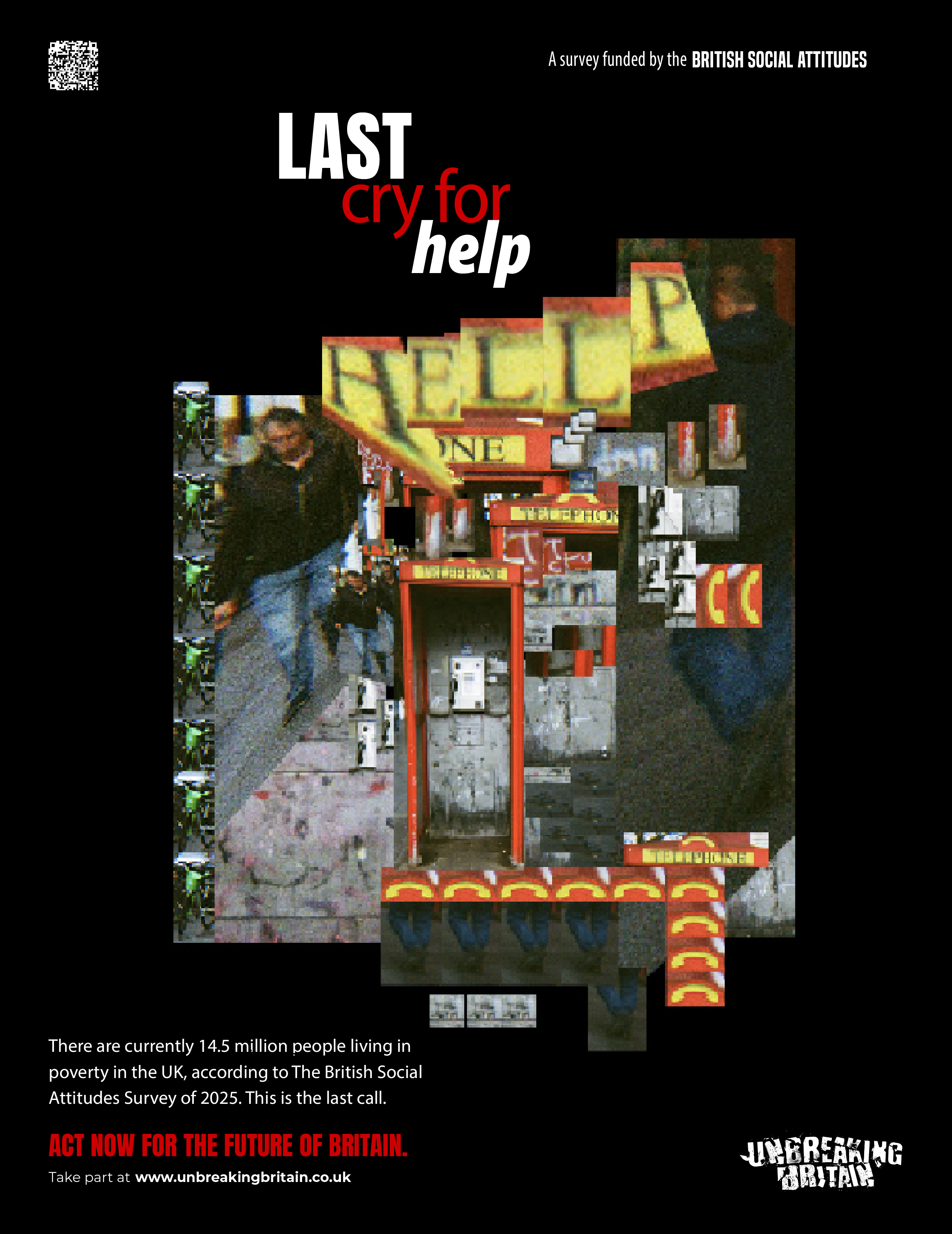
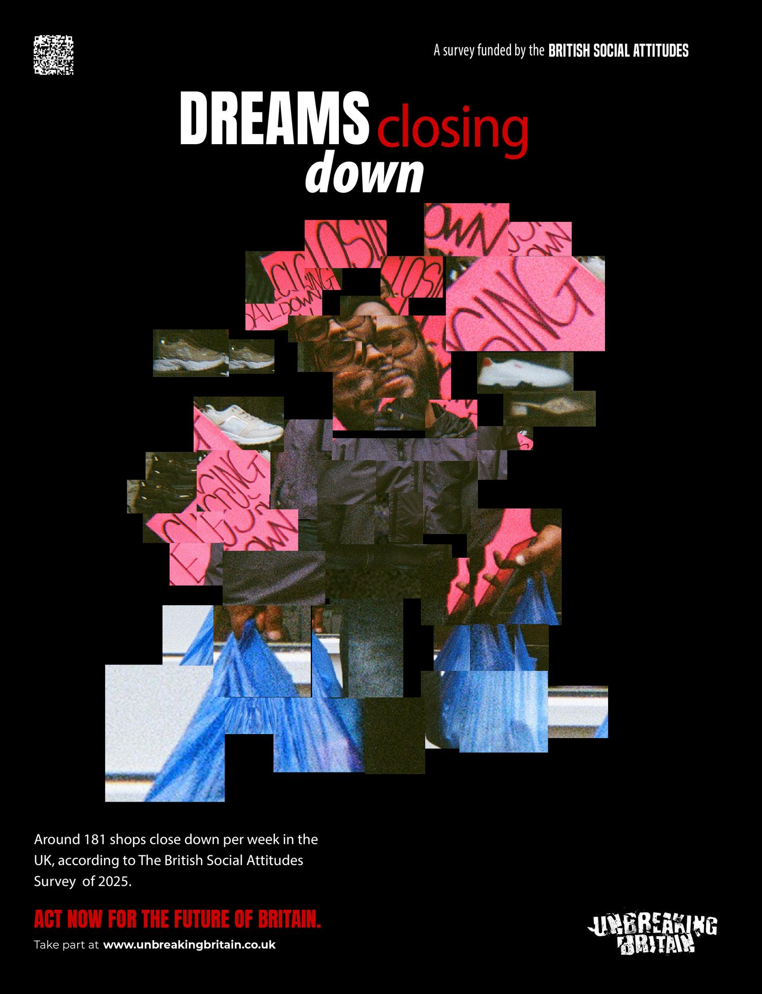
These three pieces collide imagery and typography. They reject clean, conceptual design for a fragmented, unpolished aesthetic closer to the lived experience of economic instability.

Typography and colour carry the confrontational tone. The bold, condensed typeface keeps the message direct and legible even within chaotic compositions, like the protest posters it descends from.
Last Cry For Help poster
Dreams Closing Down poster
Hope This Train Has Left poster

Impact

The project sets deliberate artistic composition against the raw immediacy of street messaging. Bus shelters were the natural medium: a mundane, overlooked setting where advertising and public discourse collide.
Bus shelter installation

Merch

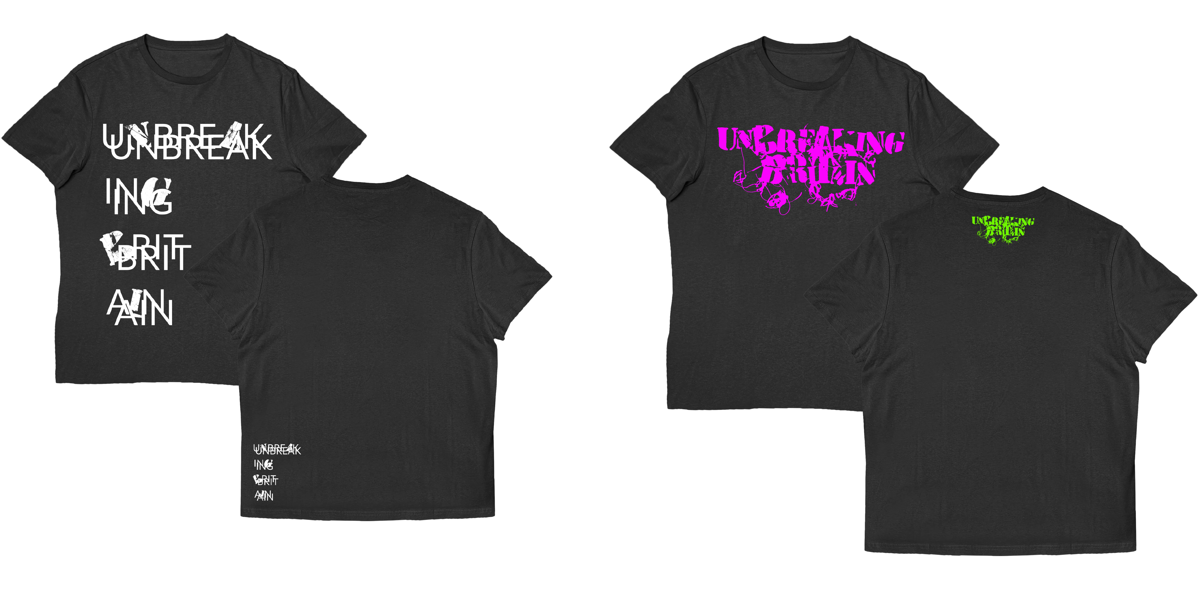
The merchandise consisted of a series of T-shirts printed with the project's logo, conceived as a wearable extension of the visual language. The logo itself was built by hand from sewn paper, broken glass, and plaster fragments, texture and imperfection included.
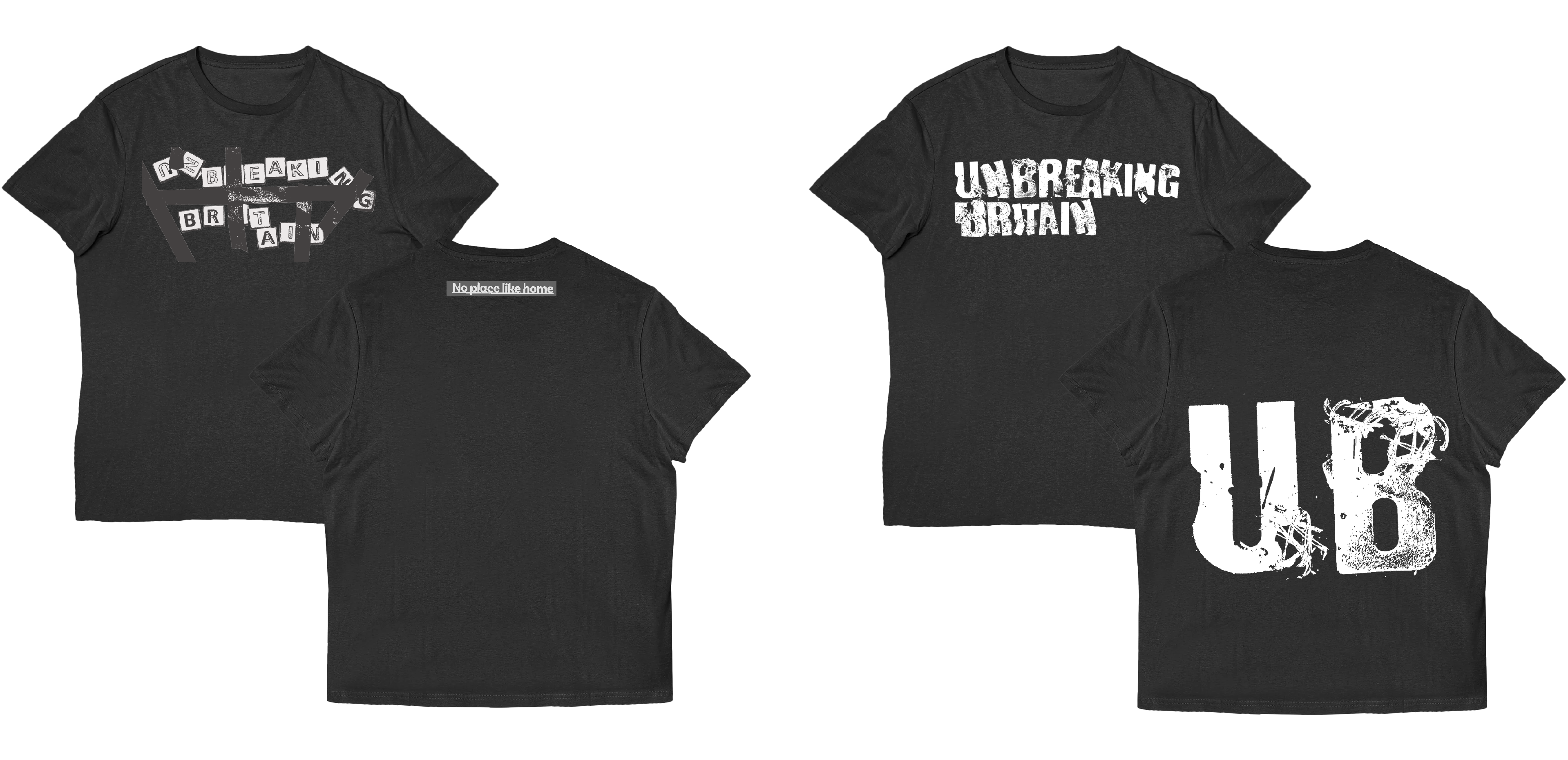
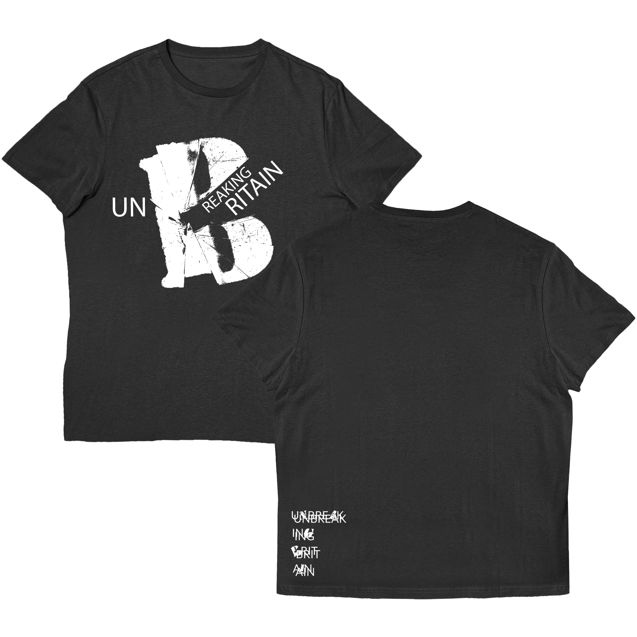
Merchandise
Merchandise mockup
More merchandise

03.1 Design
as Activism

Don't Look Away: Truths of the Economic Crisis

A politically charged print series that uses a defiant aesthetic and screenprinting to expose the realities of economic decline.

Don't Look Away print

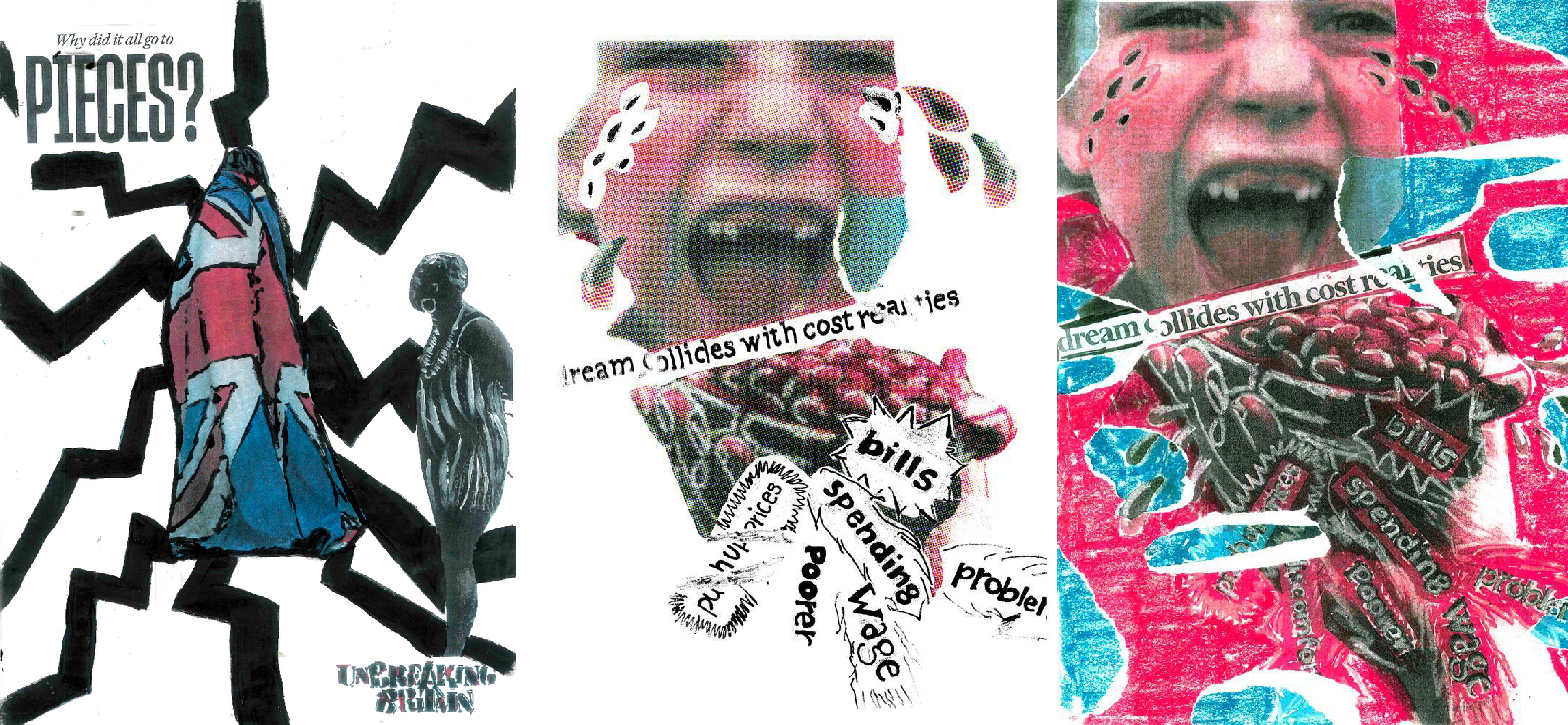
Nearly 100 sketches and test prints went into this project's visual language until the work felt raw and immediate. Inspired by urban protest art, punk DIY, and political printmaking, it pushed analogue design to its limits: painting, hand-drawn typography, collage, original photography, and repeated xerox photocopying, with digital input kept to a minimum.

Street installation
Design process

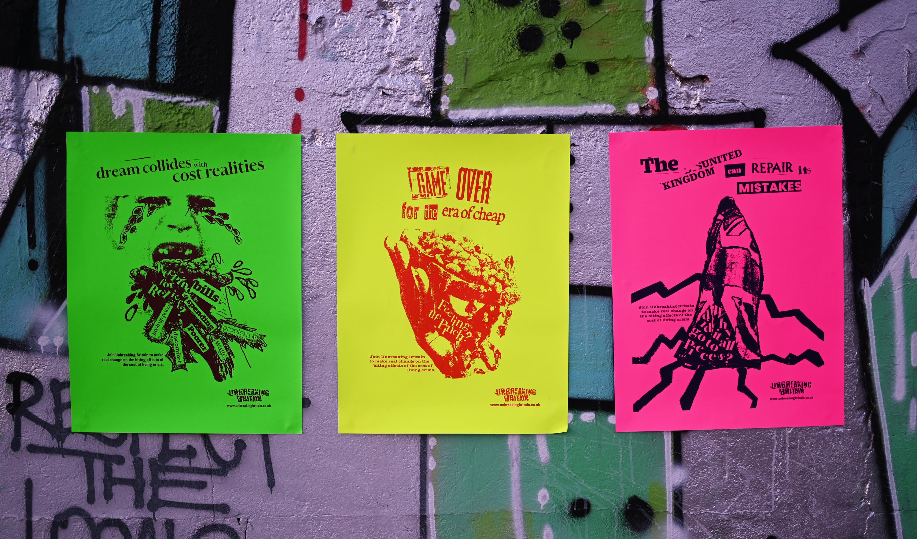
This work was built on the premise that when people encounter something unsettling and visually offbeat, they tend to slow down and engage. That moment of disruption is what makes it effective.

Street installation

Design Process

We knew from the start that the depth and texture this project needed was beyond digital tools. That decision brought technical challenges, above all keeping the posters cohesive across multiple analogue techniques: screen printing, collage, painting, and photography.

Screen printing demands that every element work within two strict finishes, halftone or high-contrast black and white, so every texture, photographic detail, and logo had to be planned for how it would translate into print as much as for its visual weight.

Process detail

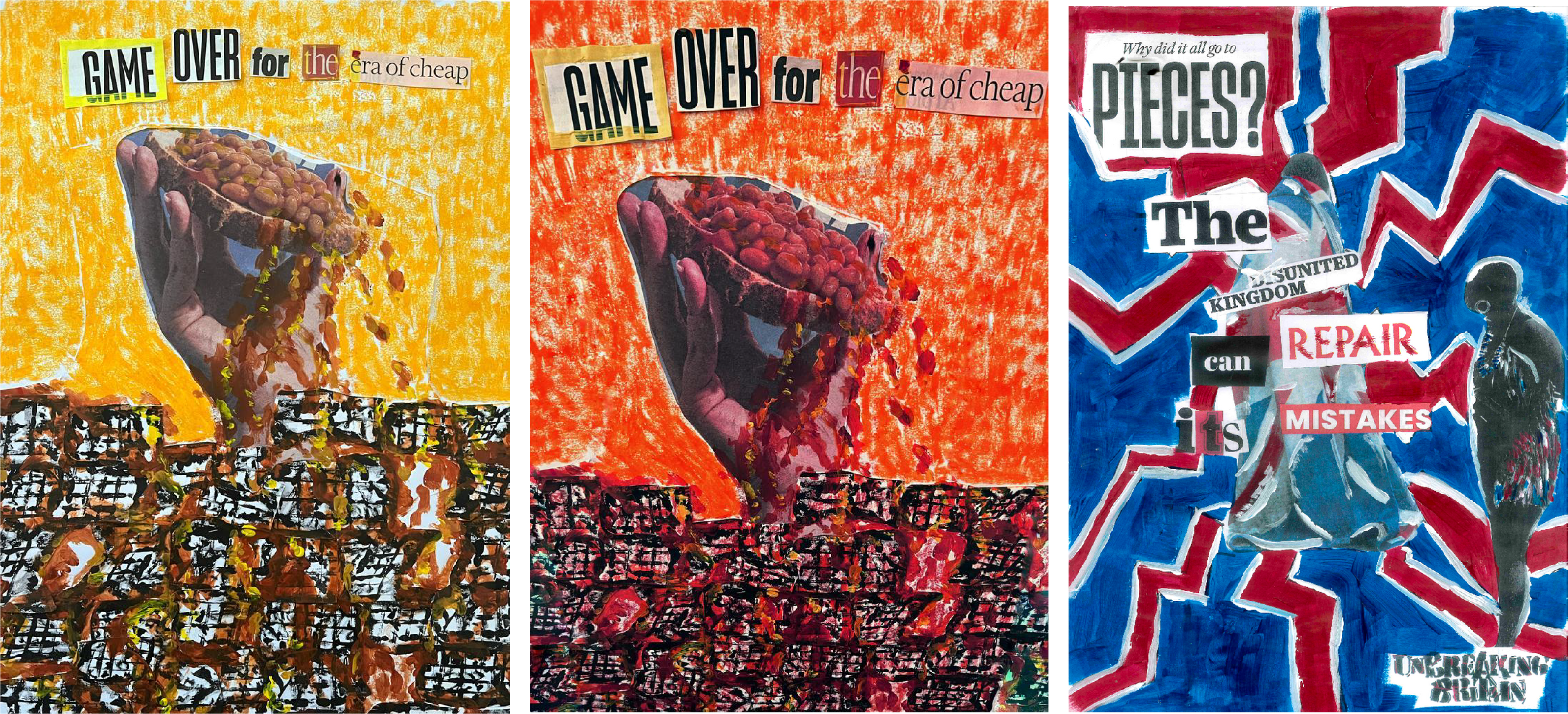
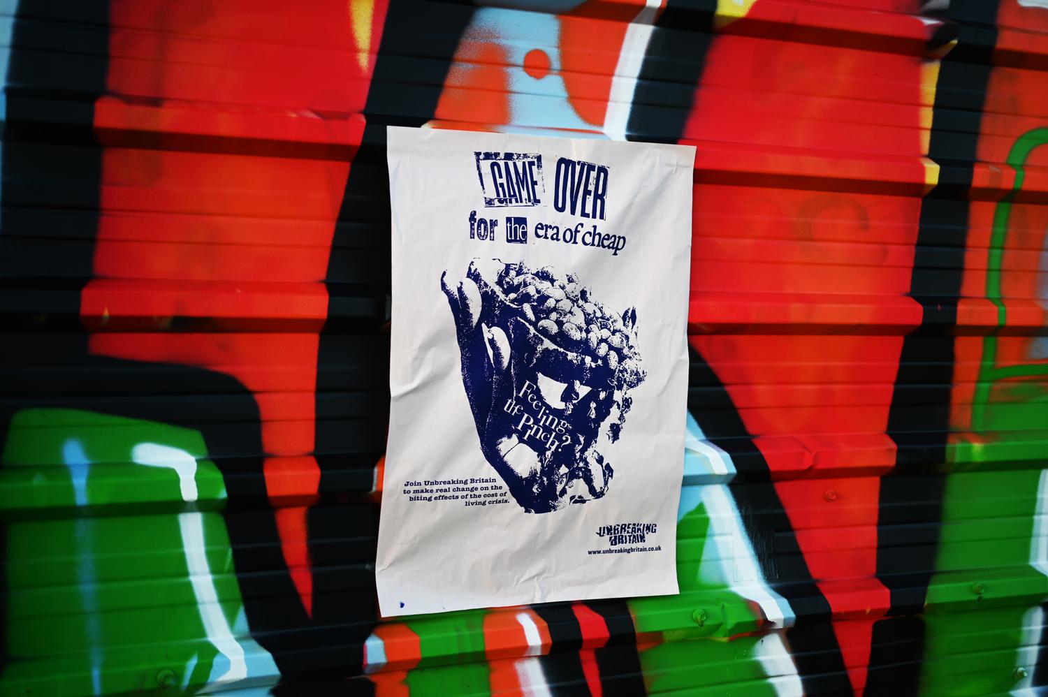
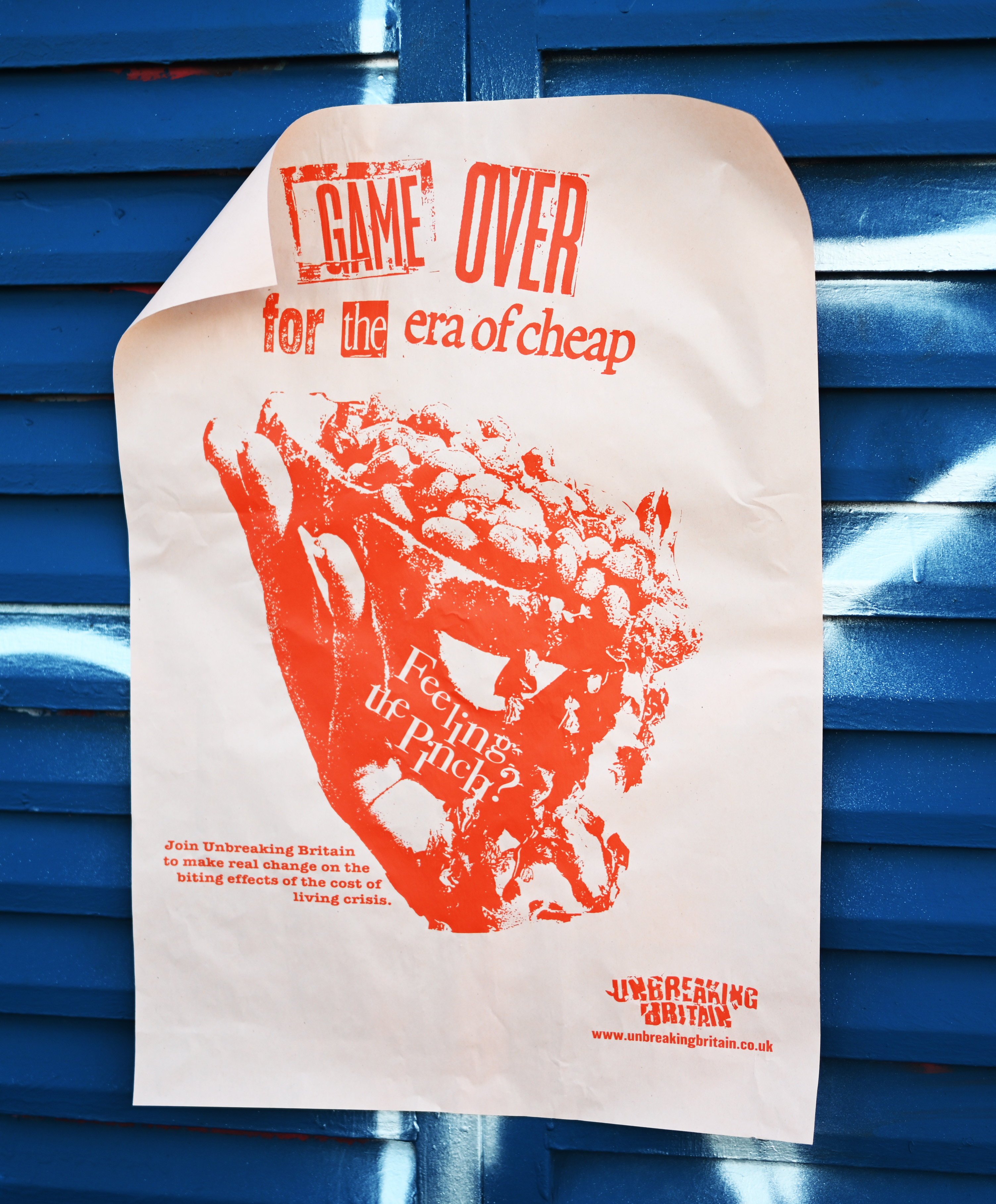
"Game Over for the Era of Cheap"
The artwork was made with acrylics to mimic the glossy, viscous texture of real bean sauce, amplifying the theme of economic decline.

"Dream Collides with Cost Realities"
The collaged newspaper photograph was layered with coloured pencil and Sharpie, evoking a childlike aesthetic to highlight themes of lost innocence and shattered dreams.

"The United Kingdom Can Repair Its Mistakes"
Features an original photograph of a homeless person wrapped in a UK flag, fractured into jagged, crack-like shapes that echo the contours of the Union Jack, reinforcing the theme of national rupture.

Process photography
Poster detail

Field Driven Research

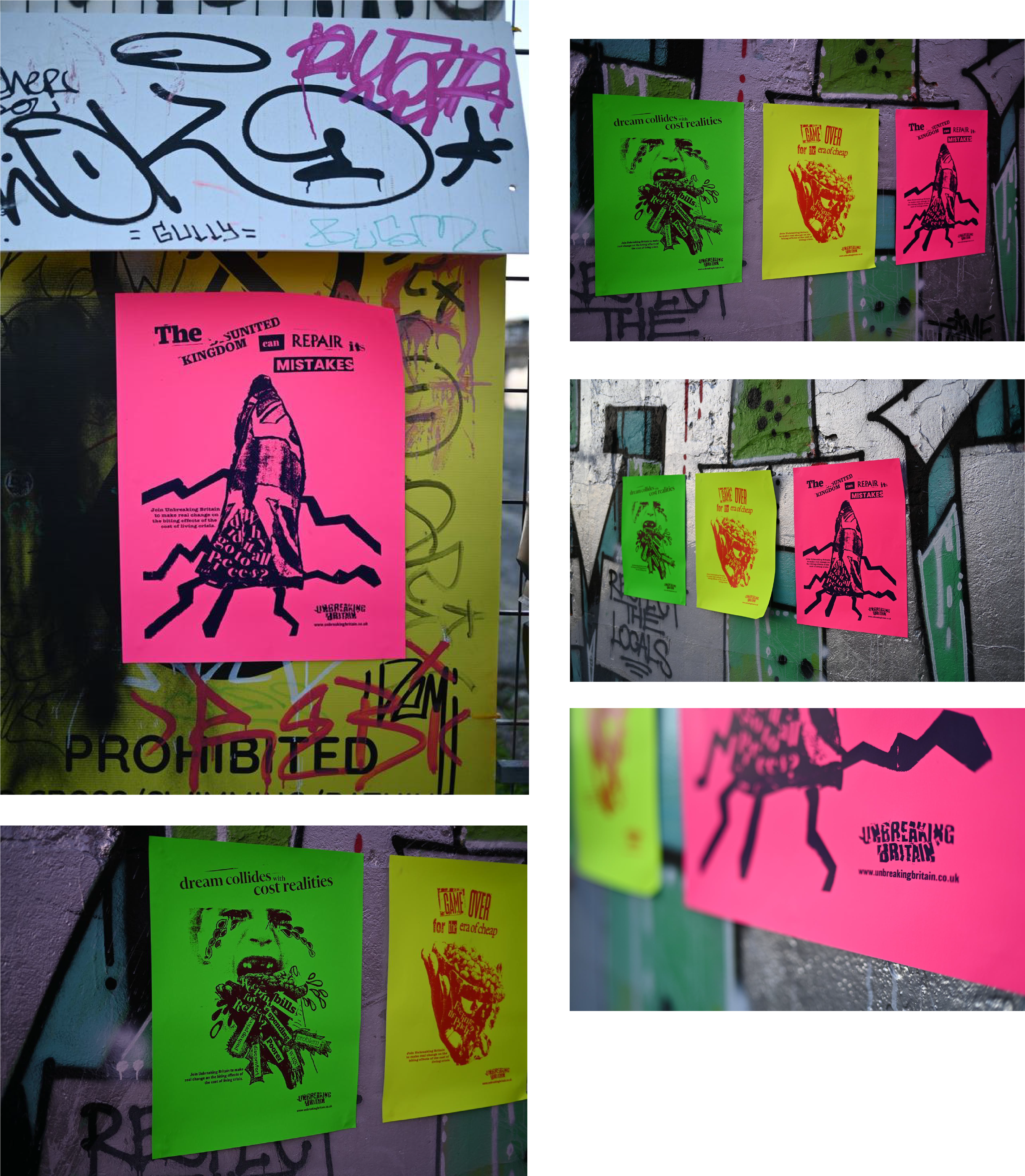
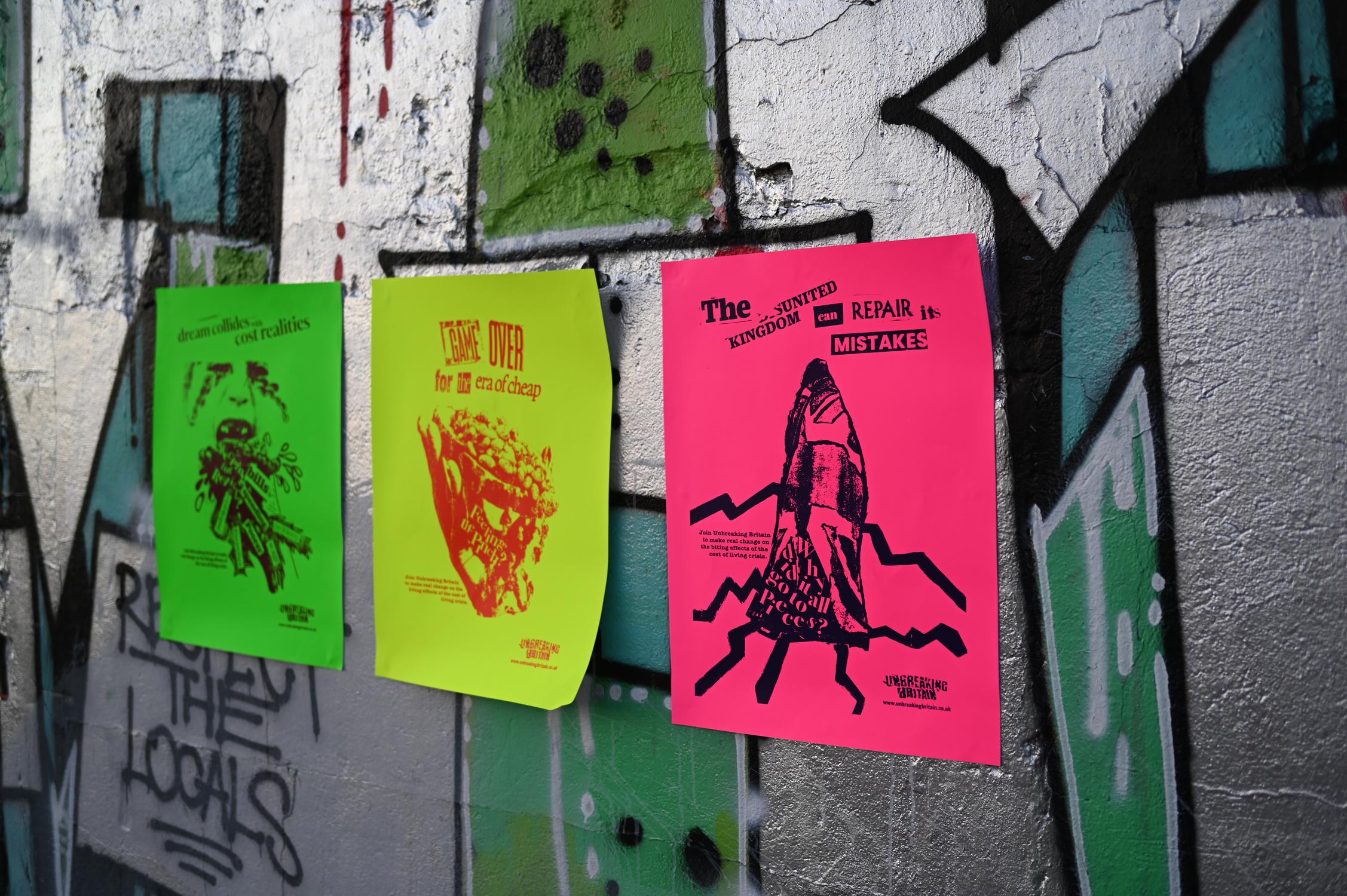
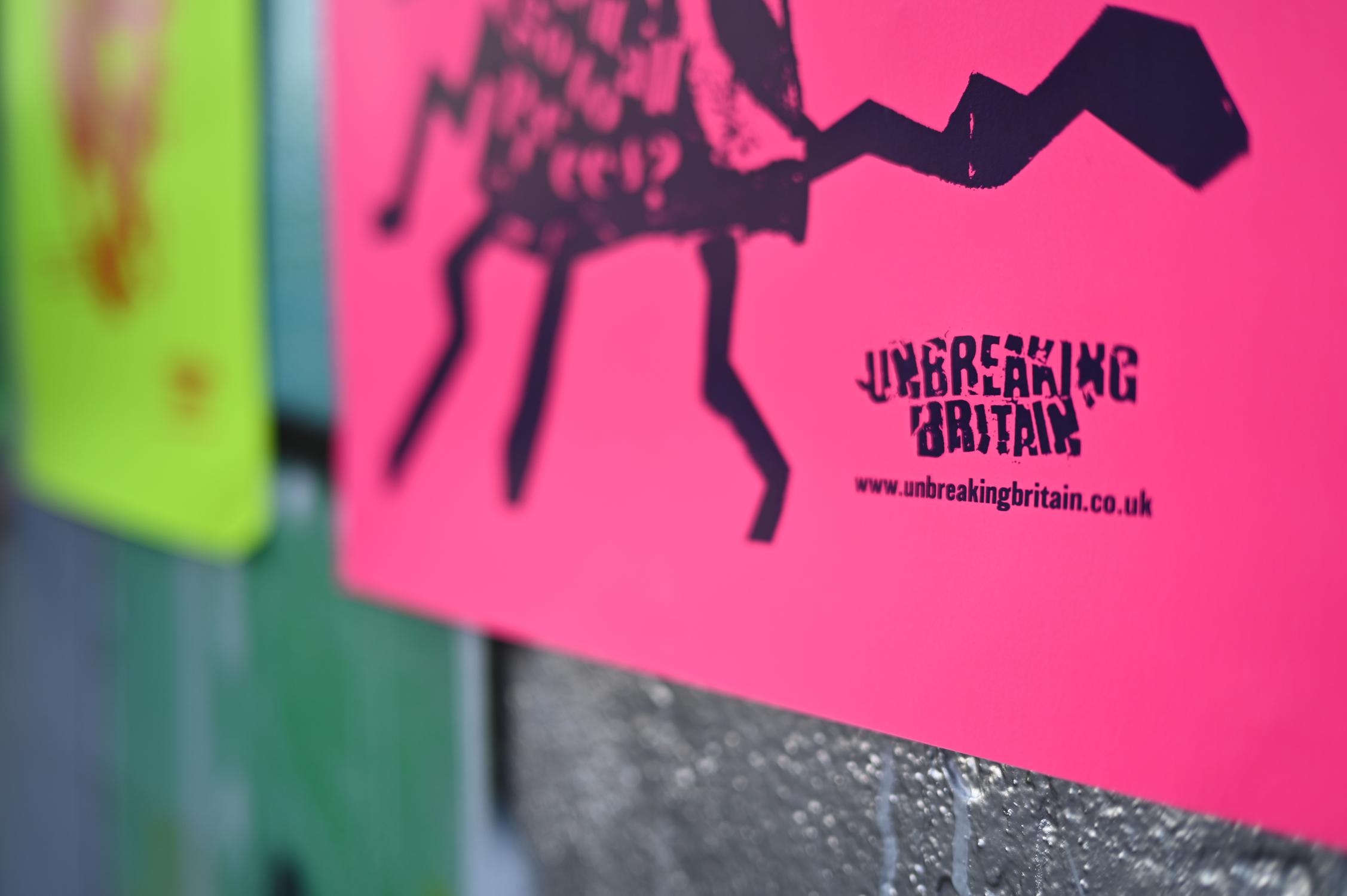
The inspiration for this series came from the "Reduced" signage in budget supermarkets across the UK. These neon labels mark a product as devalued and near-discard. Their fluorescent palette was borrowed to mirror how society treats people in poverty: reduced, unwanted.

Reduced signage research

Screen printing was the natural choice, as much statement as technique. It demands deliberate decisions in composition, colour, and materiality; nothing about it is automatic.

A layer of dark humour runs through the work; it borrows the visual language of advertising, then reveals something far more unsettling underneath.

Screen printing process

Execution & Impact

While photographing the posters we watched passersby stop and stare. What sets this work apart from other crisis campaigns is its rawness: a protest-led, punk-informed aesthetic in a field dominated by polished, pleasing design.

The posters aim to spark conversation and make people confront the crisis in ways they might not have before.

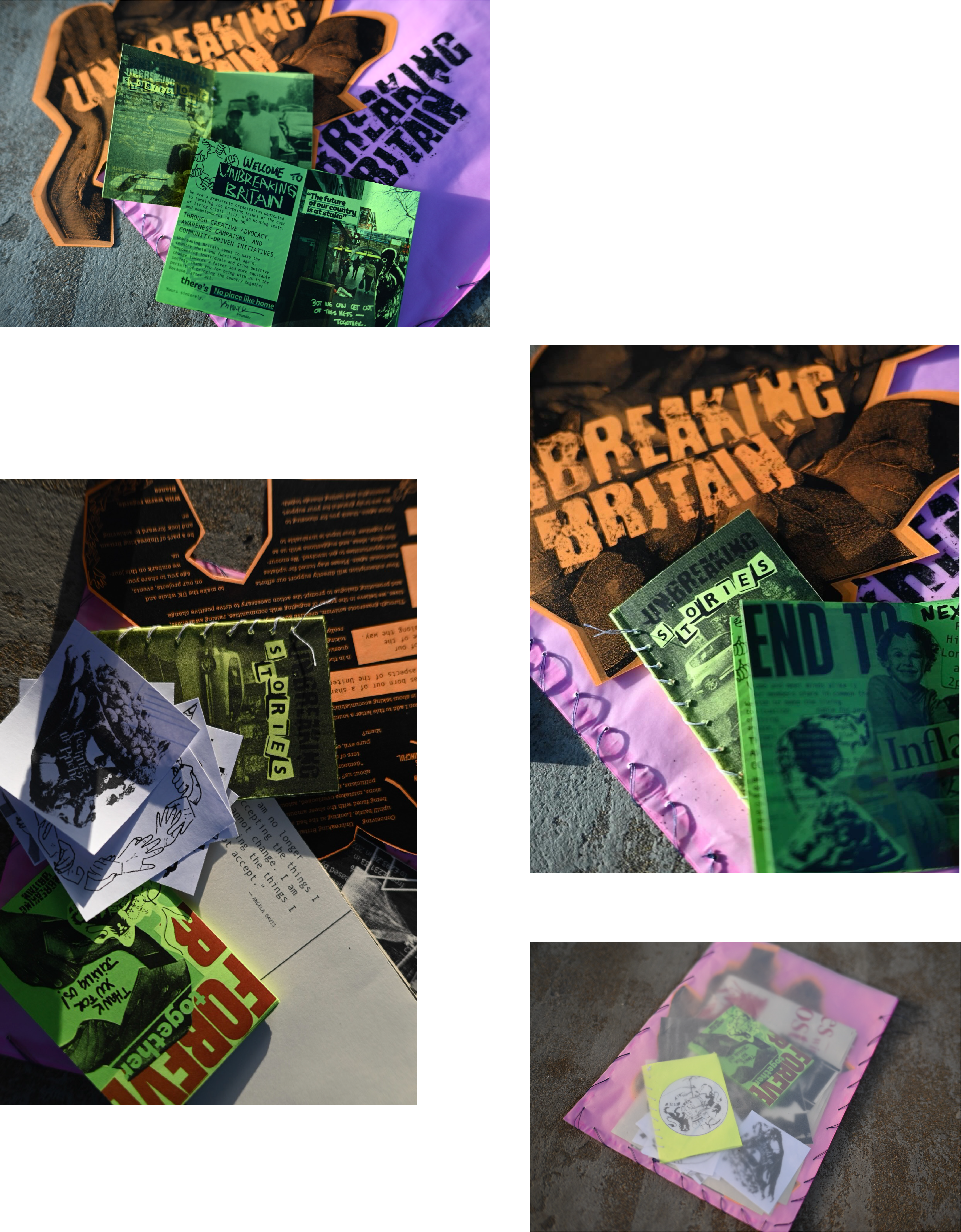
Welcome kit
Final installation