Be nice
to the Lady
We handcraft cultural storytelling
through brand identity and editorial design.
We handcraft cultural storytelling
through brand identity and editorial design.
Part research book, part design manifesto, this project imagines how graphic design can support the message of a grassroots NGO helping people cope with the cost of living and homelessness in a country on the brink of collapse.
Unbreaking Britain began with disbelief at watching the UK's economy, public institutions, and standards of living decline over the past decade.
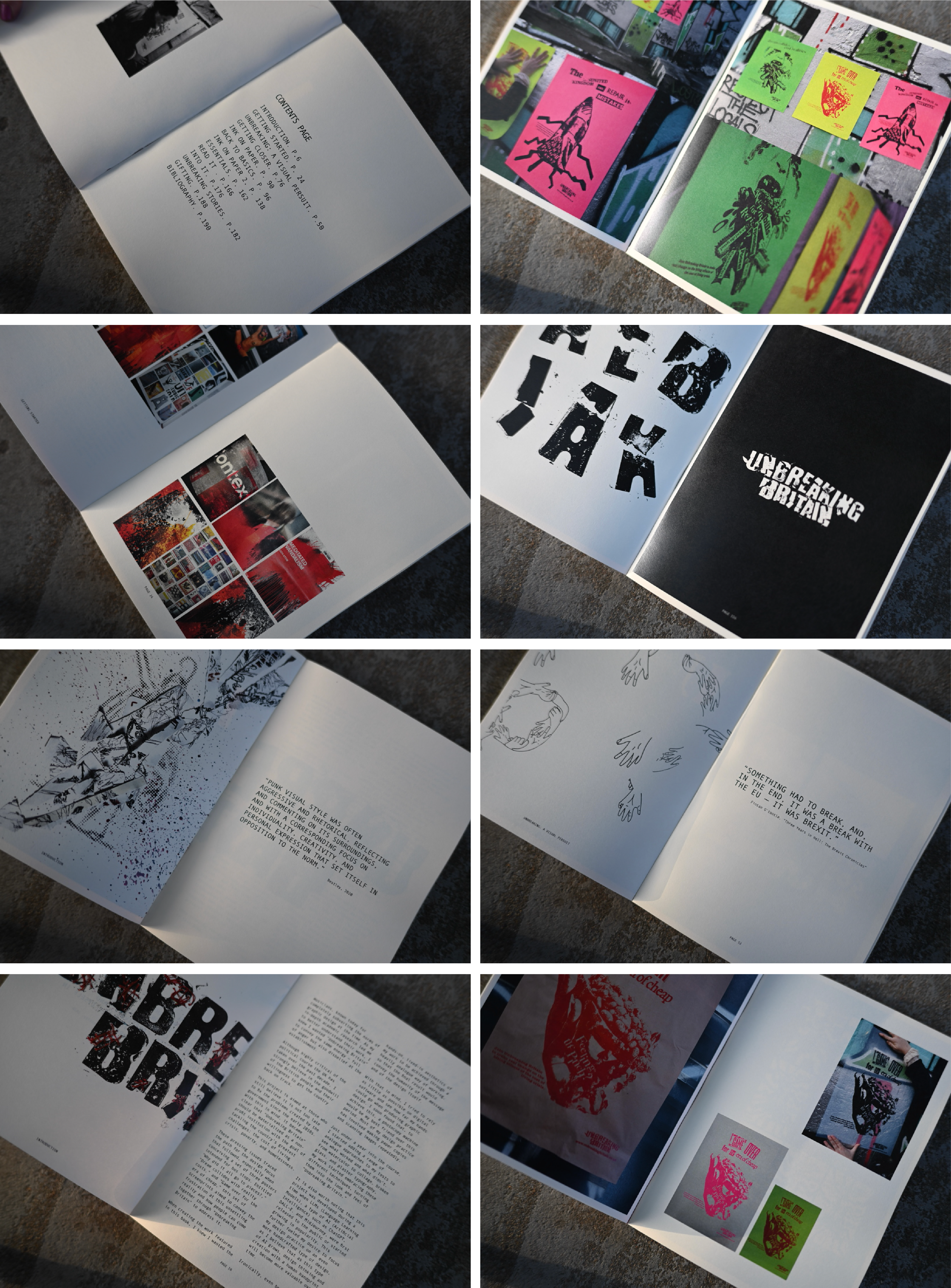
The book runs to more than 150 pages across five tactile, real-world design outcomes. Each chapter proposes design responses to social, political, and economic problems.
We come from journalism and a fascination with current affairs, so this work, produced entirely in-house, reads as social commentary as much as graphic design. It borrows the hands-on, DIY punk energy of David Carson, Jamie Reid, Corita Kent, and Jean-Michel Basquiat.
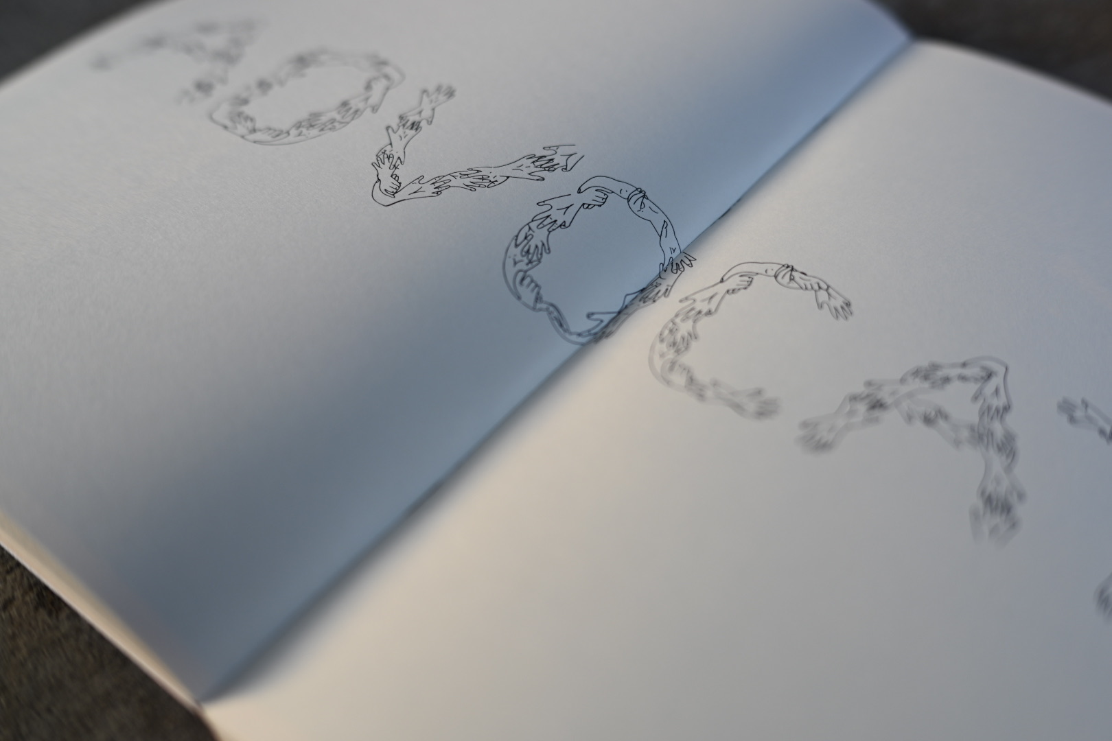
The visual language of Unbreaking Britain was built on one guiding principle: keep the human hand visible in every piece. In an era of AI-generated imagery and sterile digital design, this project leaned fully into analogue methods, such as photocopying, collage, watercolour, broken glass, and plaster typography.
Hands became the central motif, repeated in illustration, photography, and typography. It felt only natural: a project about collective action, made entirely by hand.
Most of the work was created with minimal digital intervention. A photocopier became the primary tool. Images were copied, scanned, degraded, and layered until they carried the raw, imperfect texture the project demanded.
The approach was guided by what felt realistic for a small social movement: affordable, accessible, and attention-grabbing. The challenge was to produce work that improved upon the often under-designed communications of real NGOs, while respecting their constraints.
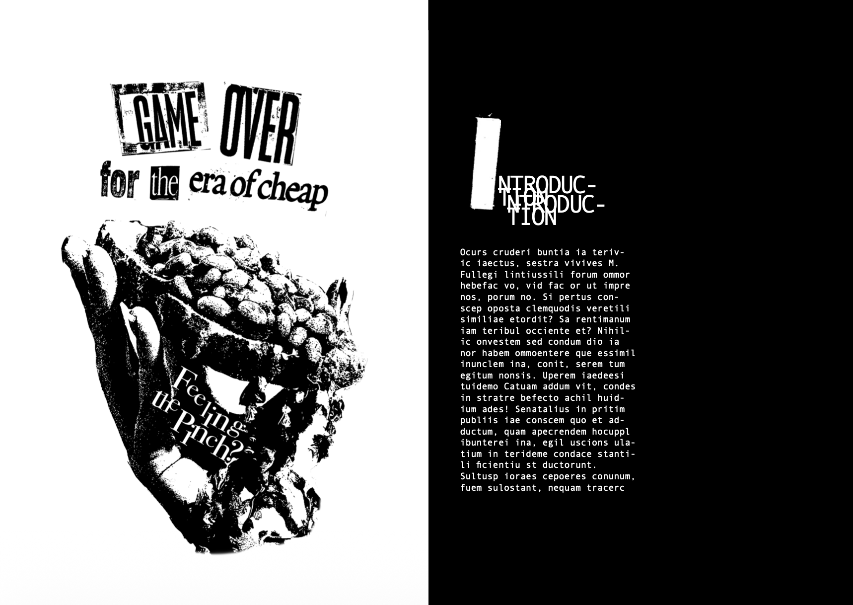
The book was printed on 150gsm off-white paper to match the analogue feel of the project. Although paperback, the pages are held by a sturdy red hard cover with a hand-sewn logo printed on paper, bound at its centre with royal blue string. The cover brings the colours of the Union Jack, which run through the whole project, to the front in a restrained way.
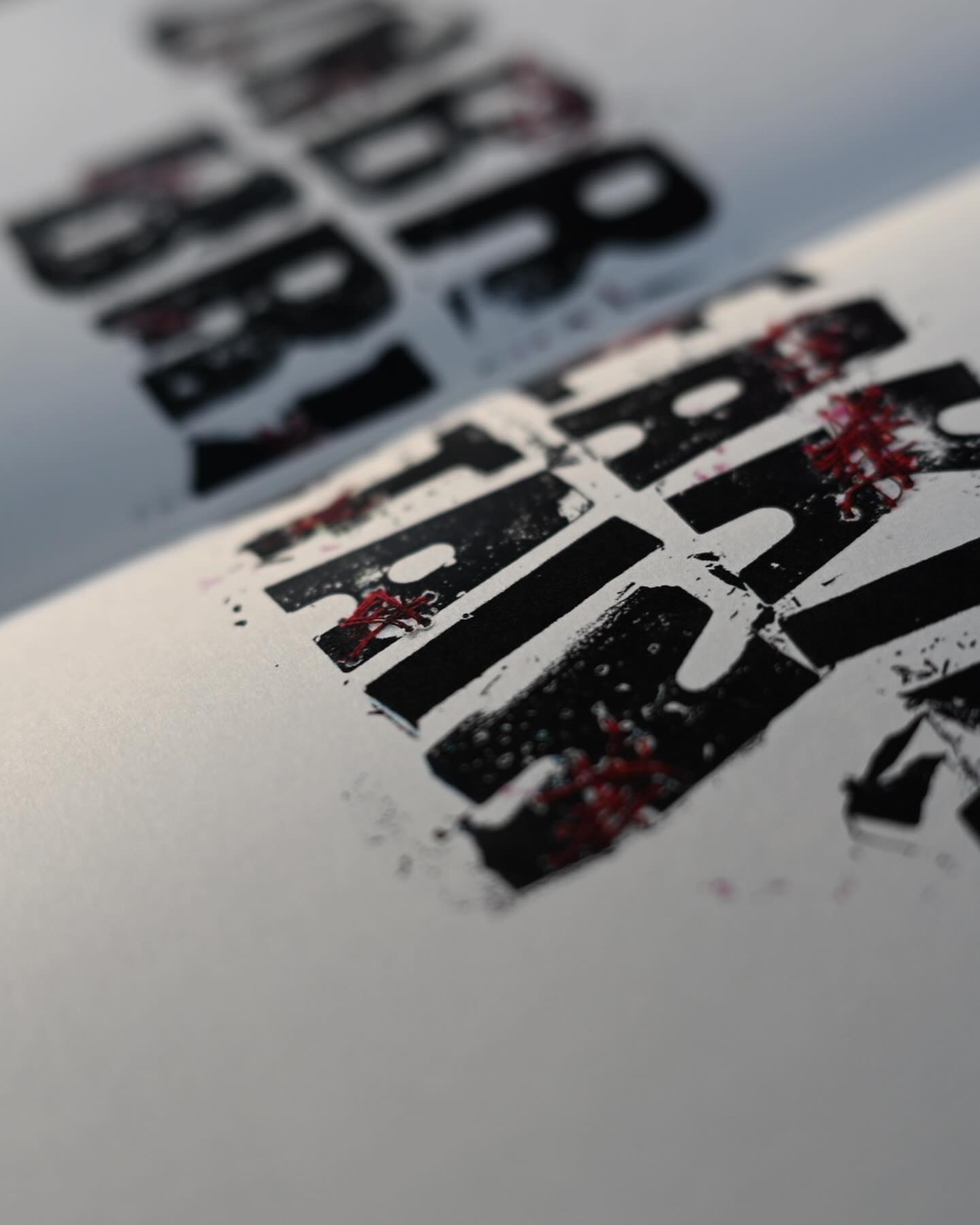
Andale Mono was chosen for its functional presence and paired with hand-made typography built for this project from letter moulds, plaster, and a hammer: letters literally in pieces. Monospaced typefaces, rooted in early digital and journalistic contexts, carry an institutional, factual tone. Where punk design leans into expressive, fractured type, Andale Mono balances the composition.
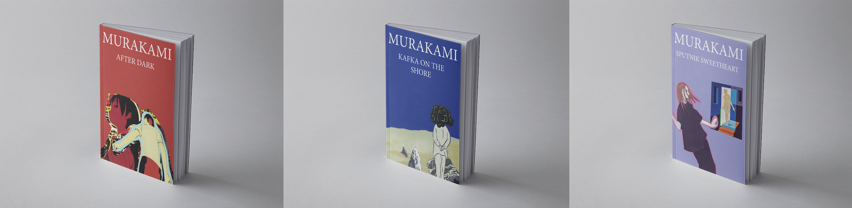
A handcrafted collage series translating Murakami's surreal storytelling into textured, immersive book covers.
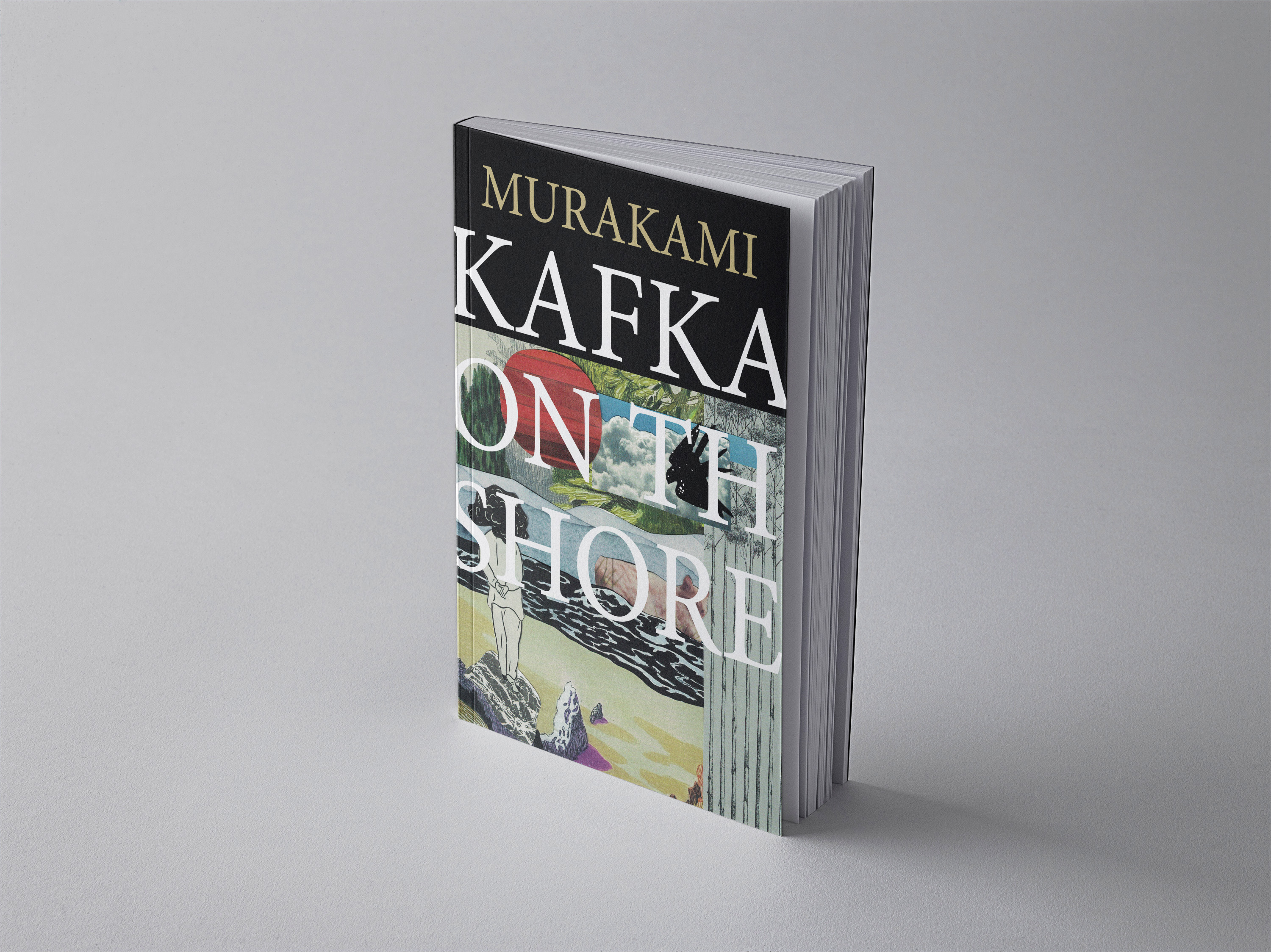
This series reimagines the covers of three of Haruki Murakami's most evocative novels: Kafka on the Shore, After Dark, and Sputnik Sweetheart. Through handcrafted collage, mixed media, and an instinctive approach to composition, the covers interpret the liminal spaces and shifting identities of Murakami's fiction.
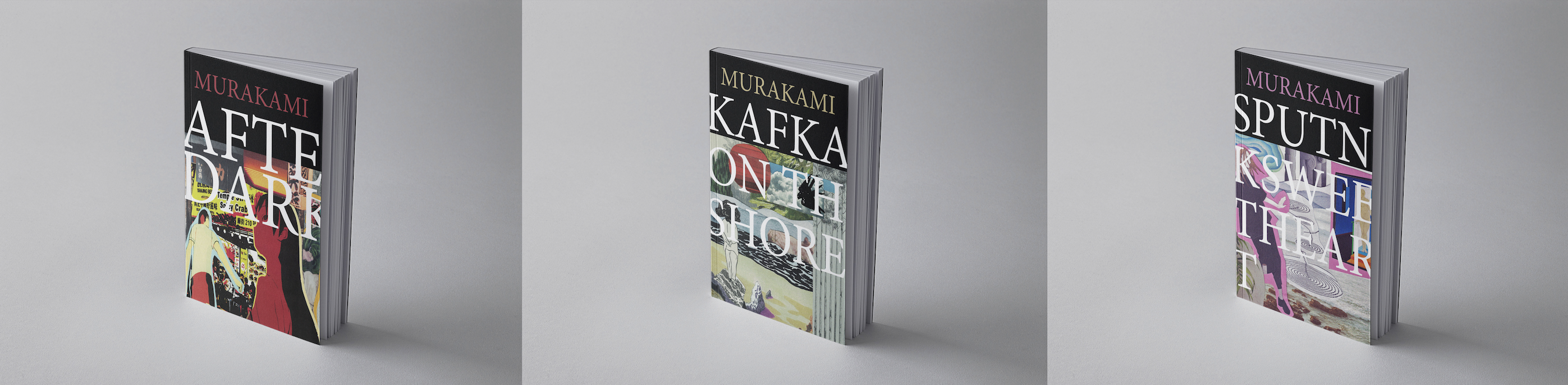
Murakami's writing is cinematic and dreamlike; he leaves meaning open so the reader can linger in interpretation. The covers follow the same principle. Rather than depict a scene, they evoke a mood, an invitation to step into ambiguous worlds.
Each piece was cut and rearranged from analogue textures, fragments of memory pushed around in scale and contrast, much like Murakami stitches reality and subconsciousness together.
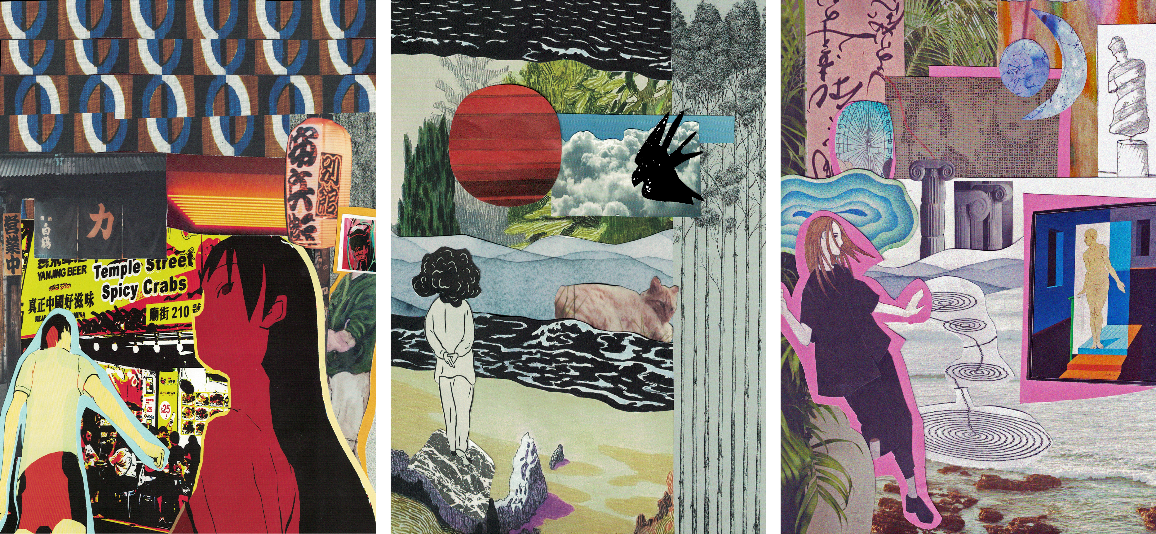
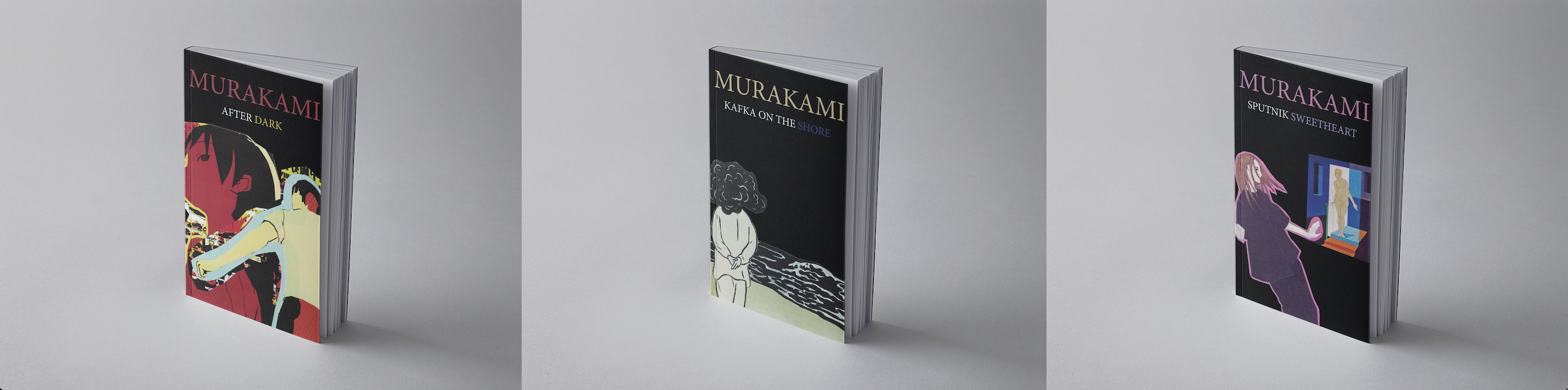
The ocean, the stone, and the deep forest reflect fate, memory, and a sense of ungraspable transformation. The composition feels both expansive and enclosed, much like the novel's protagonist, who is both searching for and escaping something.
Nocturnal, fragmented, and voyeuristic. The collage captures the unease of Tokyo's night, where characters drift in and out of reality. Neon lights, signage, and distorted figures create a world between wakefulness and dreams.
A meditation on longing and distance, the composition echoes the novel's themes of love, absence, and the search for something just out of reach. The fragments, postcards, a satellite, shifting landscapes, suggest a world where reality bends, much like the elusive connections between the characters.
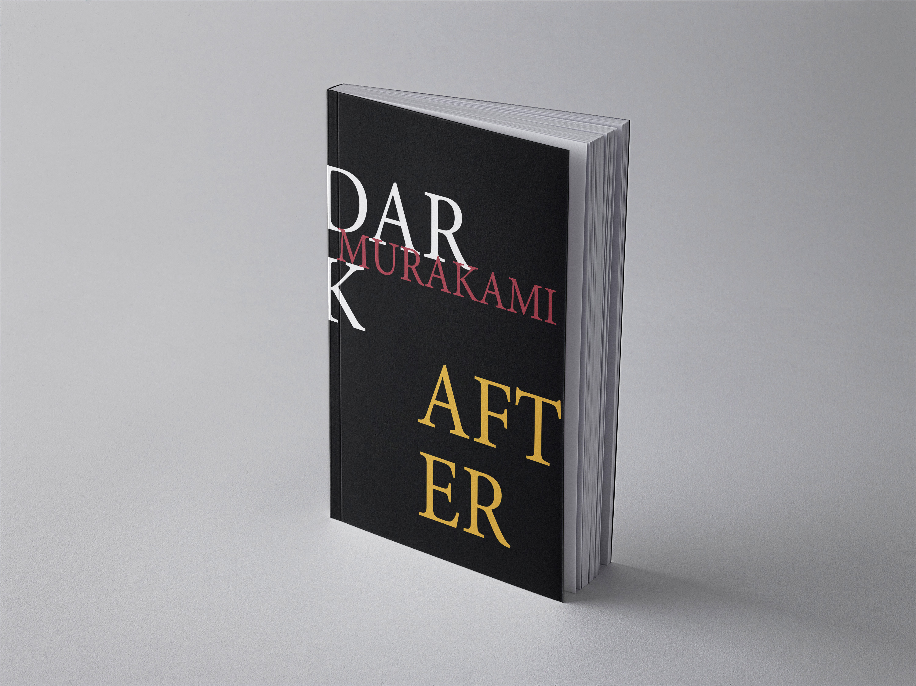
Murakami's novels sit between the tangible and the intangible: the subconscious seeps into reality, and ordinary objects hold a quiet significance. Collage works the way the mind does; it pieces stored imagery, emotion, and symbols into something new. That belief drove the series.
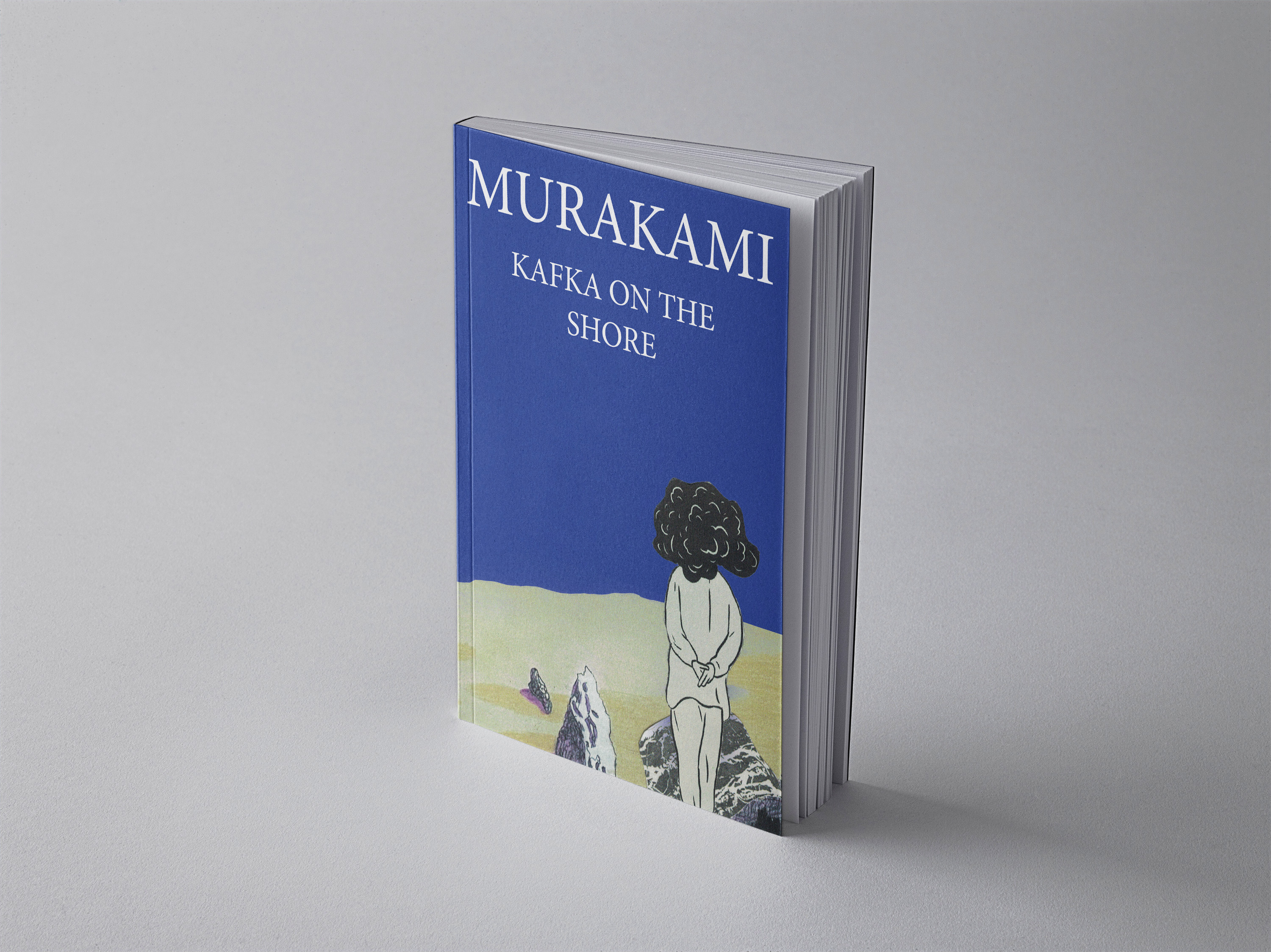
The process was experimental and tactile. Each composition began with hand-cut fragments from magazines, scanned textures, and printed materials, arranged and rearranged until the balance felt right.
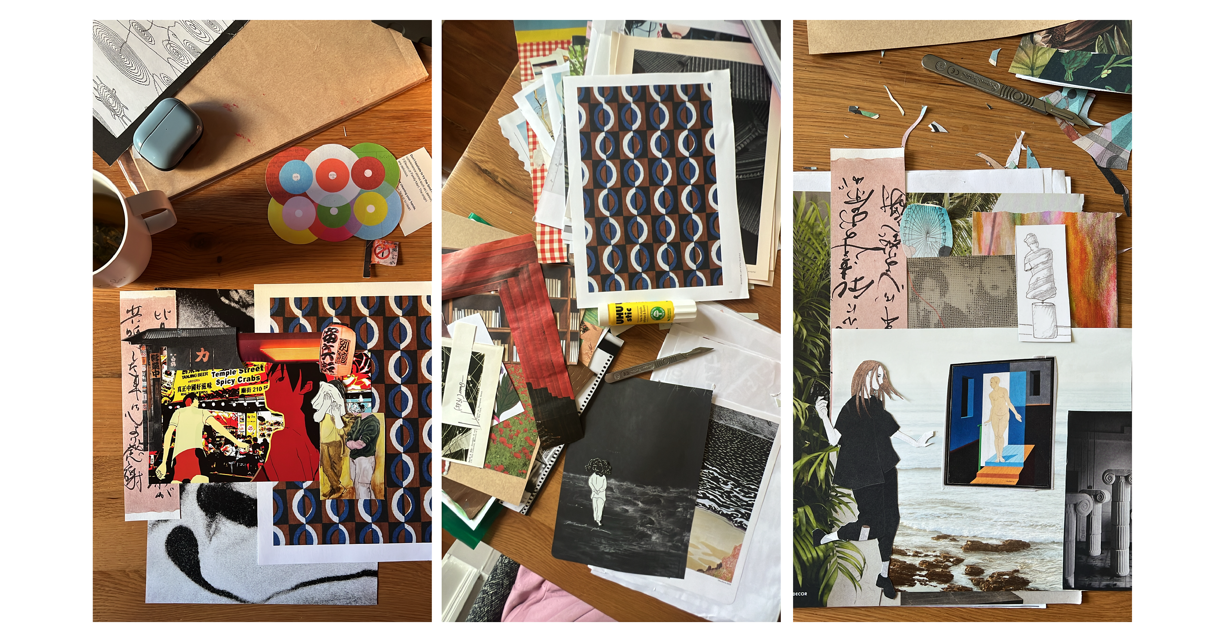
Murakami builds his narratives on recurring motifs, and the design process mirrored that. The same set of cut-outs was reconfigured again and again, and unexpected relationships kept surfacing. Background became foreground, a detail took over the frame, and a small shift in placement changed the emotional weight of the whole piece.